Cool Tones
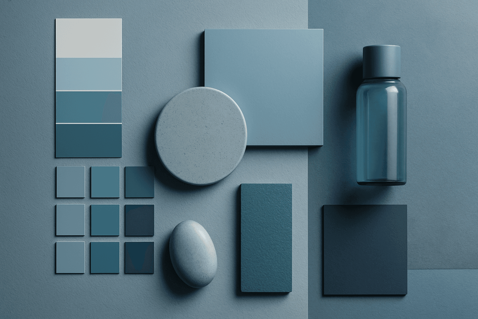
Cool Tones are colors with blue, green, cyan, teal, gray, or silver undertones. They create calm, clarity, professionalism, and modernity.
Definition
Cool Tones are colors with blue, green, cyan, teal, gray, or silver undertones. They create calm, clarity, professionalism, and modernity.
Visual Characteristics
- Blue, teal, mint, silver, cool gray, and greenish color relationships.
- Often feels clean, calm, clinical, futuristic, or trustworthy.
- Works with technology, healthcare, architecture, corporate visuals, and water imagery.
Best Use Cases
- Healthcare, technology, SaaS, finance, architecture, wellness, and clean business imagery.
- Images about trust, focus, clarity, safety, innovation, and calm systems.
- Modern product scenes with glass, metal, cool lighting, and clean backgrounds.
Prompt Examples
- A clean healthcare reception area, cool tones, wide angle, serene atmosphere, modern design.
- A cool tones technology background, glass reflection, blue gray palette, negative space.
- A modern office workspace, cool tones, soft light, professional stock photography.
Adobe Stock Potential
Cool Tones have strong stock value for healthcare, technology, business, and architecture. Add human warmth when the image should feel approachable.
FAQ
What moods do cool tones create?
They often create calm, clarity, professionalism, cleanliness, or futuristic mood.
Can cool tones feel too cold?
Yes. Add natural light, soft shadows, or a warm accent if needed.
Continue Exploring
Related Prompts
Cool Color Palette
Cool Color Palette is useful when you want an image to feel clear, composed, and modern. It is common in healthcare, technology, finance, architecture, SaaS, clean beauty, and wellness visuals. The palette can reduce emotional heat and make a design feel more trustworthy or focused. For AI creators, this keyword is helpful when a scene needs professionalism or calm rather than warmth and intimacy.
Neutral Colors
Neutral Colors are among the most commercially useful palette keywords. They help AI images feel clean, versatile, and layout-friendly. Neutral images can support text overlays, product packaging, editorial design, websites, and presentations without competing with brand colors. For stock creators, this is a practical keyword because buyers often need visuals that can blend into many design systems.
Monochromatic Colors
Monochromatic Colors are useful when an AI image needs strong cohesion and a design-led feel. Because the palette is limited, the viewer pays more attention to form, light, texture, and layout. This can make images feel editorial, premium, minimal, or graphic. For stock creators, monochromatic images can be useful for backgrounds, posters, fashion, architecture, product shots, and brand campaigns where color consistency matters.
Muted Colors
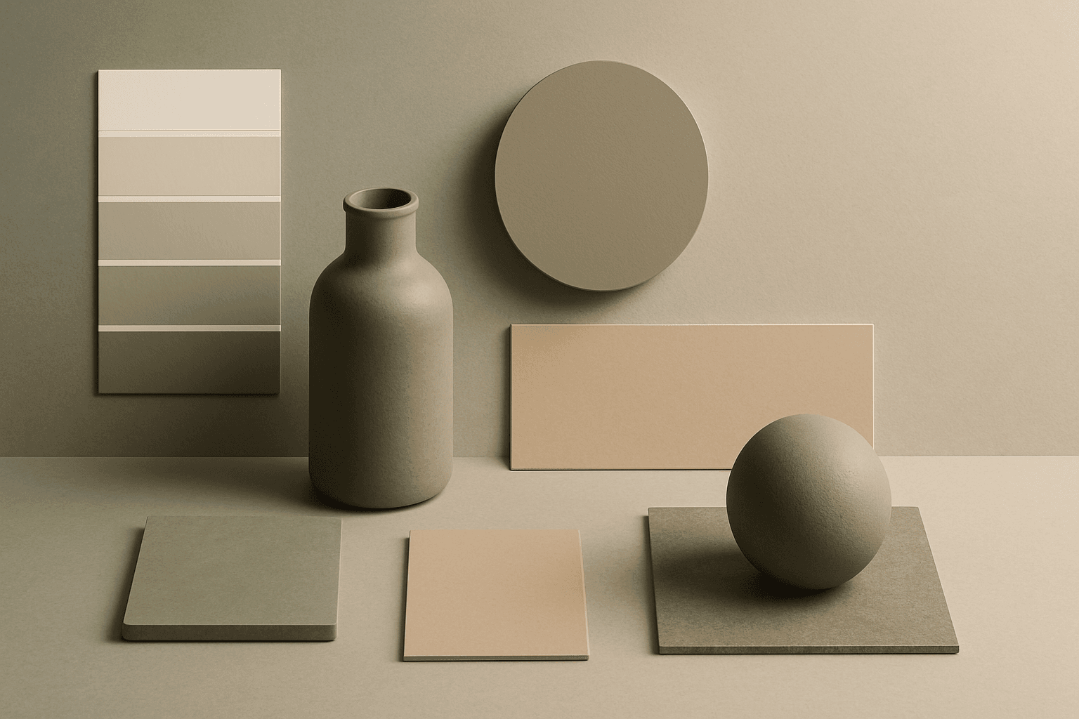
Muted Colors are useful when you want AI-generated images to feel sophisticated instead of loud. They are common in interiors, lifestyle photography, fashion editorials, packaging, wellness brands, and business imagery. For stock creators, muted palettes can make images more flexible because they do not overpower text or brand elements. They also help avoid the overly saturated look that many AI images produce by default.
Earth Tone Colors
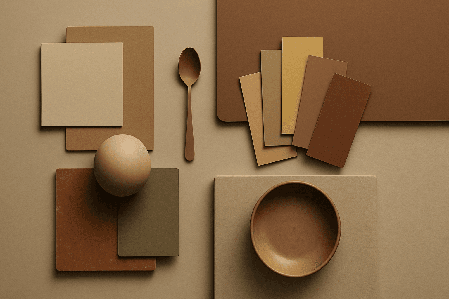
Earth Tone Colors are useful for creating grounded, organic, and commercially current AI images. They are common in wellness branding, sustainable packaging, interiors, handmade products, food, outdoor lifestyle, and natural beauty campaigns. For stock creators, earth tones can communicate authenticity and trust without needing obvious eco symbols. They also work well in minimalist layouts because the palette is calm but still warm.
Complementary Colors
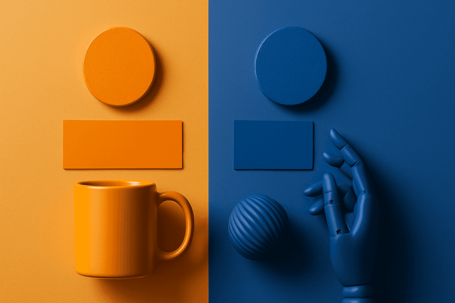
Complementary Colors are useful when an AI image needs to stand out quickly. The contrast can make a subject pop, create visual tension, and improve thumbnail impact. This keyword is common in movie posters, sports ads, product campaigns, music visuals, gaming art, and modern editorial imagery. For beginners, the key is balance: complementary palettes work best when one color leads and the opposite color supports it.