Color Blocking Layout
Color blocking layout is a popular compositional technique that emphasizes the use of large, solid-color sections placed adjacent to each other to create striking, clean images. In AI image generation, incorporating color blocking layouts helps achieve modern, editorial-style visuals characterized by minimalism and vibrant contrast. This style is widely used in fashion, graphic design, and advertising to draw the viewer's eye and create memorable, bold imagery. By specifying color blocking layout in prompts, users can steer AI models to focus on geometric organization of colors, resulting in polished images with refined lighting and subtle depth while maintaining simplicity and clarity.
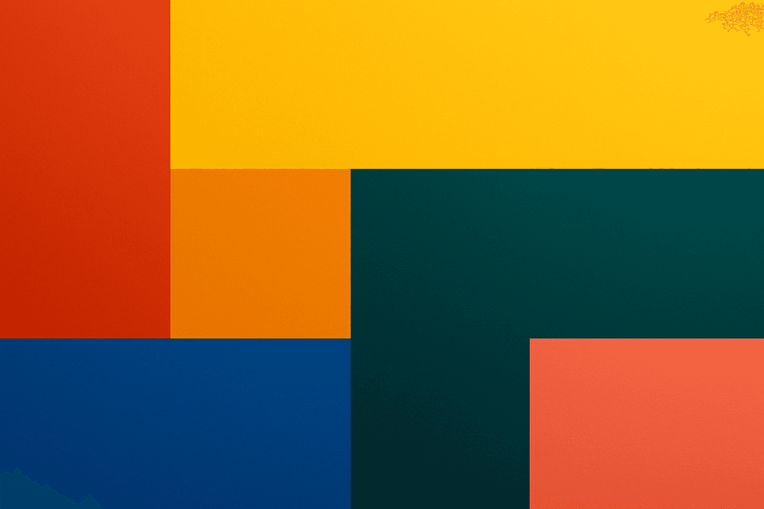
Definition
Color blocking layout is a composition approach characterized by arranging large, solid areas of contrasting color next to each other. It simplifies the image into distinct color zones, creating a bold, modern visual effect. Adding this term in AI image prompts directs the model to emphasize clear color segmentation and geometric color fields, resulting in images with strong contrasts and clean shapes.
Visual Characteristics
- Distinct, flat blocks of color with minimal gradients
- Sharp edges defining the boundaries between color areas
- Balanced composition emphasizing contrast and simplicity
Prompt Formula
Use combinations of color and layout descriptors to achieve color blocking effects. Phrases like "color blocking layout," "solid color blocks," and "geometric color segmentation" work well. Include details about lighting and material to enhance realism and depth without losing flat color impact.
- color blocking layout
- solid color blocks
- geometric color segmentation
- refined lighting
- realistic materials
Best Use Cases
- Fashion editorials focusing on vibrant outfits and backgrounds
- Graphic design presentations for branding or product packaging
- Advertising visuals emphasizing strong color contrasts
Creative Variations
To diversify outputs, vary the color palettes from monochrome to complementary or analogous schemes. Experiment with different shapes of the blocks—rectangles, circles, or abstract forms. Combine soft or directional lighting to add subtle depth, or try different material appearances such as matte versus glossy finishes. These variations keep compositions fresh and engaging.
- Change color schemes: monochrome, complementary, analogous
- Use different block shapes: rectangular, circular, abstract
- Adjust lighting: soft, directional, natural
- Vary material textures: matte, glossy, fabric-like
FAQ
How does color blocking layout improve AI image composition?
It simplifies and clarifies the image by dividing it into distinct color areas, enhancing visual impact and making the composition bold and modern.
Can color blocking layout be combined with other composition styles?
Yes, it can complement styles like minimalist design or geometric composition to create varied yet harmonious visuals.
Continue Exploring
Related Prompts

Negative Space Layout
Negative space layout is a vital compositional technique that leverages empty spaces within an image to create visual balance, harmony, and focus. By strategically using negative space, artists and designers can guide the viewer's eye toward the main subject while ensuring the overall design feels uncluttered and elegant. In AI image generation, specifying negative space layout helps produce images with refined balance, preventing overcrowding of elements and enhancing the premium, editorial look. This technique is essential in minimalist art, branding, editorial photography, and modern design where clarity and subtlety are valued.
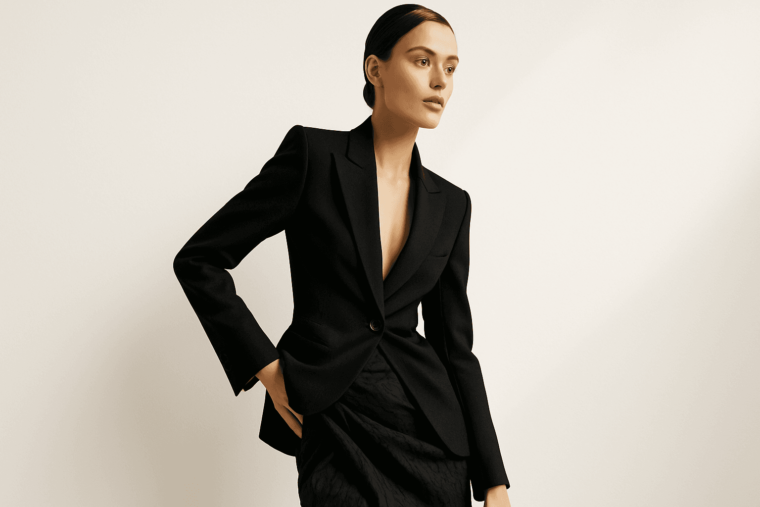
Dynamic Asymmetric Layout
Dynamic asymmetric layouts break away from the predictability of centered designs by introducing imbalance that attracts the viewer's eye across the composition. This style is widely used in editorial design, advertising, and digital media to convey energy, modernity, and sophistication. By emphasizing contrast and selective clustering, the layout guides attention strategically without relying on rigid balance. In AI image generation, specifying dynamic asymmetric layout in your prompt encourages the model to produce visually compelling scenes with elements arranged unevenly yet harmoniously, enhancing the overall narrative or mood of the image. This approach works particularly well for premium stock images and design headlines where a clean, polished look with subtle depth is desired.
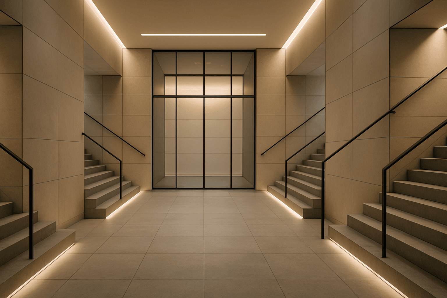
Symmetry And Balance
Symmetry and balance are foundational principles in visual arts and crucial for composing captivating AI-generated images. Using these keywords prompts AI models to structure scenes with mirrored or harmoniously weighted elements, creating aesthetically pleasing and organized visuals. Balanced compositions evoke feelings of stability and calm, while symmetry creates formal harmony admired in architecture, product photography, and portraiture. Incorporating these concepts refines the image's coherence and appeal, benefiting creatives who require polished, professional results. Whether applied to landscapes, objects, or abstract designs, symmetry, and balance guide the AI toward harmonious imagery that resonates with viewers on a subconscious level.
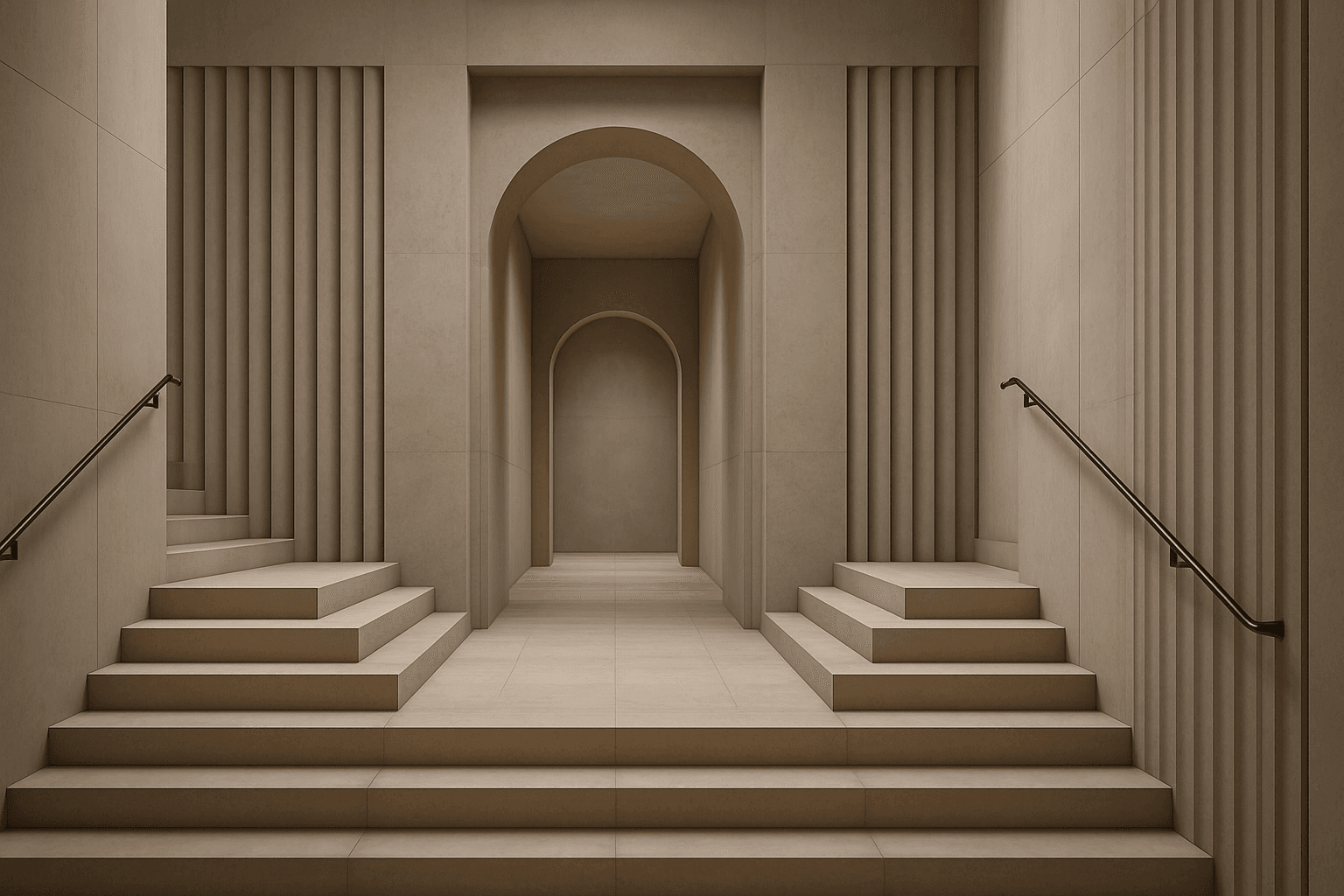
Symmetrical Visual Balance
Symmetrical visual balance is a fundamental principle of composition that guides AI image generation toward harmonious and stable designs. By specifying this keyword, users encourage the visual content to be evenly arranged on both sides of a central axis, which can evoke feelings of calmness and structure. This approach suits a range of imagery, from portraits and architecture to product photography, giving a refined and polished look. When applied in prompts, it helps achieve clean editorial styles with subtle depth and premium polish, making the results ideal for hero images or thumbnails in a modern content library.
Golden Ratio Layout
The Golden Ratio Layout is a timeless compositional principle found in nature, art, and design, used to establish visually harmonious and aesthetically compelling images. Applying this concept to AI image generation helps create compositions where the subject placement and background elements follow the golden section, improving viewer engagement and creating a sense of balance and flow. This layout is especially favored in editorial photography, branding visuals, and architectural renders to evoke sophistication and natural beauty. By including the Golden Ratio Layout keyword in your prompts, you encourage AI models to prioritize this balanced and elegant arrangement, enhancing the professional quality of outputs.

Silhouette Composition
Silhouette Composition in AI-generated imagery leverages the compelling power of shape over detail, capturing viewers' attention through stark contrasts and simple, yet meaningful forms. This technique strips away textures, colors, and intricate details, focusing instead on the subject's external contour, making it ideal for communicating concepts efficiently and evocatively. Using silhouette composition in prompts allows creators to produce images that are elegant, minimalist, and universally legible across various visual designs, from editorial hero images to branding visuals. This approach aligns well with a modern design ethos that values clarity, boldness, and emotional resonance, facilitating creative storytelling with visual economy.