Visual Hierarchy Principles
Visual Hierarchy Principles fundamentally shape how elements within an image are perceived and prioritized. By applying these principles in AI-generated images, prompt writers can ensure the composition directs the viewer's gaze naturally, improving clarity and emotional impact. Effective hierarchy balances size, color contrast, brightness, and positioning to create focal points and guide the eye smoothly. Understanding this concept benefits creators aiming for professional-quality compositions, enhancing storytelling through visual prioritization.

Definition
Visual Hierarchy Principles involve organizing visual elements to establish an order of importance, guiding the viewer’s eye through a design. In AI image prompts, specifying these principles influences how the AI arranges subjects, contrasts, and sizes to create a natural reading flow and enhance compositional storytelling.
- Emphasis on key subjects via size or brightness
- Arrangement of elements to guide viewer attention
- Use of contrast and color to differentiate importance
Prompt Formula
To incorporate Visual Hierarchy into AI prompts, use phrase structures that specify focal emphasis and compositional balance.
- "[Subject] prominently in foreground with soft-focus background"
- "Strong contrast between main object and surroundings"
- "Leading lines directing attention to focal point"
- "Balanced distribution of elements ensuring visual flow"
Best Use Cases
- Editorial photography focusing on a feature story subject
- Product imagery that needs clear emphasis on merchandise
- Social media ads requiring fast visual comprehension and impact
Industry Applications
- Advertising: Crafting images with clear key messages and product focus
- Editorial Design: Enhancing readability and visual narrative
- Ecommerce: Highlighting products to increase consumer attention and sales
Common Mistakes
A frequent mistake is neglecting clear focal points, resulting in cluttered or confusing images where no element stands out. Overusing contrasting colors or placing multiple elements with equal weight can muddle the visual message. Avoid vague or contradictory prompt terms regarding emphasis which leads to inconsistent hierarchy.
- Avoid equal emphasis on all elements preventing clear focus
- Do not overload the scene with competing bright colors
- Avoid random placement of objects that break visual flow
FAQ
How can I ensure my AI image prompt creates a strong visual hierarchy?
Specify focal points using terms like 'prominently' or 'centered,' mention contrast levels, and describe background blur or lighting to separate primary subjects from secondary elements.
Why is visual hierarchy important in AI-generated images?
It directs viewer attention and communicates the intended message quickly and clearly, improving aesthetic appeal and functional impact of the image.
Continue Exploring
Related Prompts
Visual Weight Balance
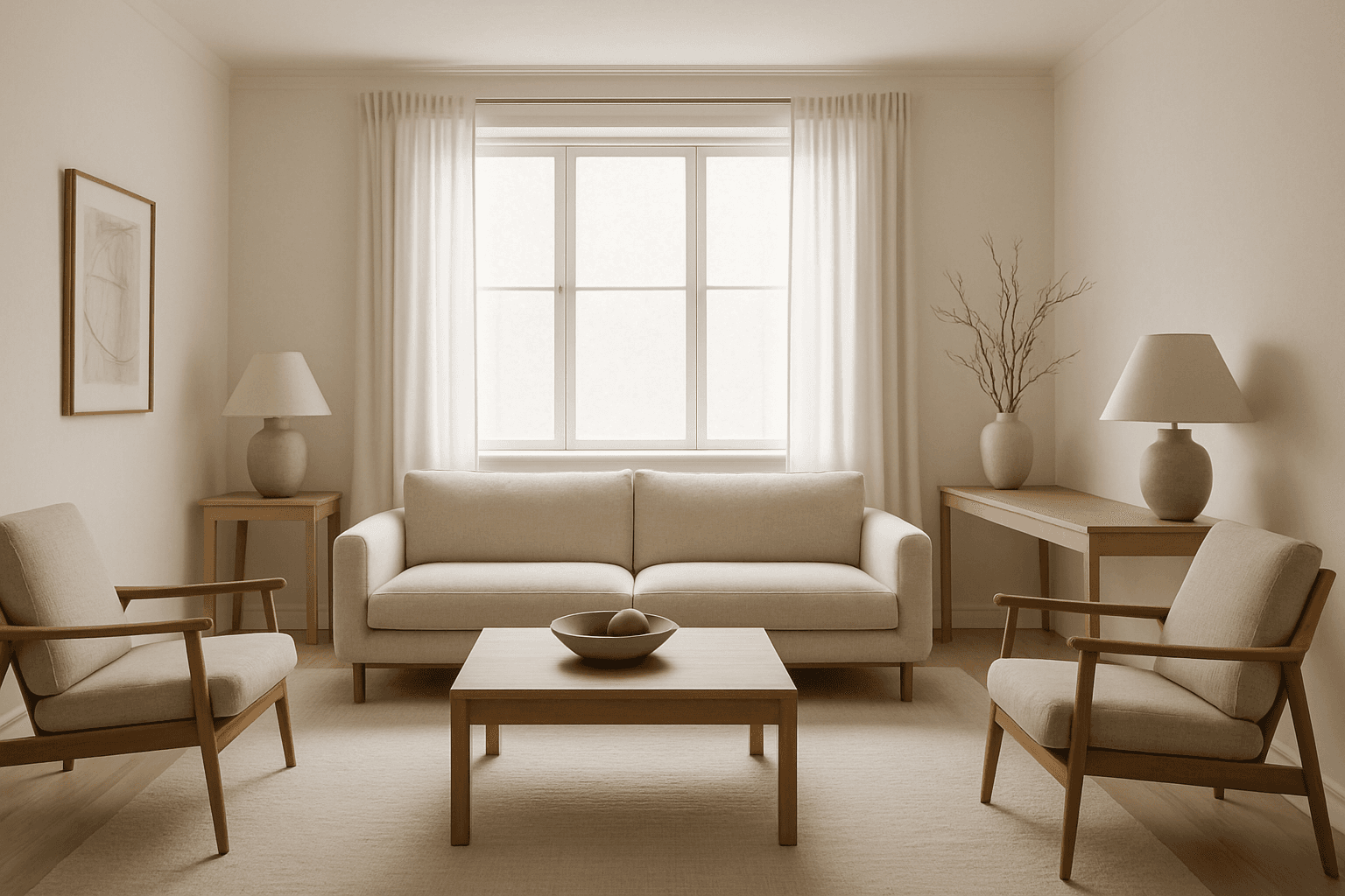
Visual Weight Balance is a fundamental principle in image composition that ensures harmonious distribution of visual elements across the frame. When crafting AI image prompts, emphasizing this keyword helps in generating images where objects, colors, and contrasts are allocated thoughtfully to prevent lopsided or cluttered scenes. Balanced visuals direct the viewer’s eye across the image naturally, creating a sense of calm and order. This balance is achieved by managing the size, color intensity, and positioning of elements so that no part overwhelms the rest. Using Visual Weight Balance in prompts is essential for editorial, product, or environmental imagery where clarity and coherence are crucial.

Tonal Contrast Composition
Tonal Contrast Composition is a fundamental principle in visual arts that governs how light and shadow interact within a scene. When applied in AI image generation, it helps create images with dramatic depth, where brighter areas attract attention and darker zones provide complementary framing. This interplay guides the viewer's eye naturally across the composition and emphasizes key elements without overwhelming color use. By focusing on tonal values, generated images gain a refined, realistic appearance reminiscent of premium editorial photography. Implementing tonal contrast thoughtfully results in believable textures, nuanced lighting, and a polished look suitable for professional design, advertising, and fine art applications.

Asymmetrical Visual Balance
Asymmetrical visual balance is a fundamental compositional technique used to create engaging and dynamic images. Rather than relying on symmetry, it balances visual interest through the thoughtful placement of diverse elements differing in size, color, or texture. This approach lends images a more natural, spontaneous feel while maintaining harmony. In AI image generation, explicitly directing asymmetrical visual balance helps craft images that are visually compelling with organic flow, useful in editorial designs, advertising, and fine art creations. Understanding this principle enhances creativity in prompt engineering, enabling more versatile and striking results.

Central Focus Composition
Central Focus Composition is a fundamental principle in visual design that directs the viewer's eye instantly to the image's main subject by positioning it at the exact center. This method leverages symmetry and balance to create images that have a strong visual impact and clear storytelling. When used in AI image generation, it ensures the subject dominates the frame and helps achieve polished, editorial-quality images ideal for a wide range of applications. This technique is especially powerful for portraits, product showcases, and conceptual art, where clarity and directness are keys.
Golden Ratio Layout
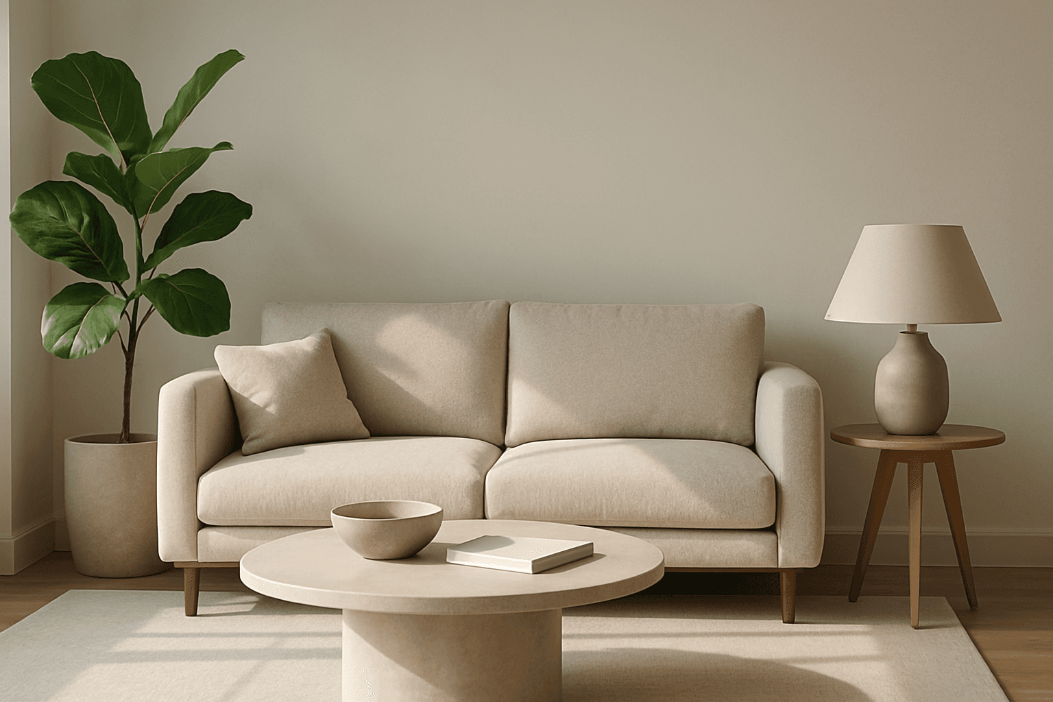
The Golden Ratio Layout is a timeless compositional principle found in nature, art, and design, used to establish visually harmonious and aesthetically compelling images. Applying this concept to AI image generation helps create compositions where the subject placement and background elements follow the golden section, improving viewer engagement and creating a sense of balance and flow. This layout is especially favored in editorial photography, branding visuals, and architectural renders to evoke sophistication and natural beauty. By including the Golden Ratio Layout keyword in your prompts, you encourage AI models to prioritize this balanced and elegant arrangement, enhancing the professional quality of outputs.

Negative Space Layout
Negative space layout is a vital compositional technique that leverages empty spaces within an image to create visual balance, harmony, and focus. By strategically using negative space, artists and designers can guide the viewer's eye toward the main subject while ensuring the overall design feels uncluttered and elegant. In AI image generation, specifying negative space layout helps produce images with refined balance, preventing overcrowding of elements and enhancing the premium, editorial look. This technique is essential in minimalist art, branding, editorial photography, and modern design where clarity and subtlety are valued.