Natural Skin Tone Palette
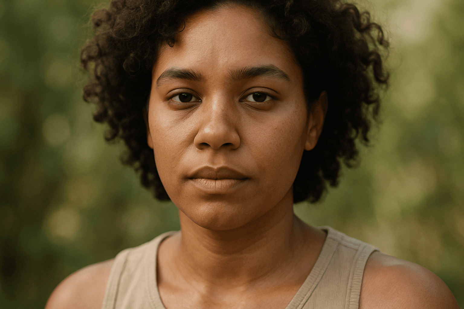
In AI image generation, achieving realistic skin colors is essential for portrait authenticity and natural appearance. The Natural Skin Tone Palette keyword guides AI models to use a spectrum of genuine human skin colors, ranging from pale to deep tones with nuanced undertones such as peach, olive, brown, and reddish hints. Integrating this color palette results in images that feel authentic and relatable, making them ideal for editorial portraits, advertising, and character design. By specifying this palette, artists and designers can avoid the pitfalls of artificial or monotone skin colors, ensuring inclusivity and vivid detail in generated imagery.
Definition
The Natural Skin Tone Palette keyword directs the AI to use a spectrum of realistic human skin colors in image generation. This helps the AI produce images where skin colors appear natural, with refined undertones and color variation that reflect real-life complexions across different ethnicities. Including this keyword results in portraits and character images that avoid artificial or monotone skin appearance.
Prompt Formula
To incorporate the Natural Skin Tone Palette effectively, use prompt patterns that specify skin tone realism alongside lighting and texture. Examples include:
- "[subject], natural skin tone palette, soft natural lighting, realistic skin texture"
- "portrait of [age, gender], natural skin tone palette, studio lighting, detailed facial features"
- "group of diverse people, natural skin tone palette, balanced color grading, high resolution"]
- These formulas ensure the AI understands the priority of authentic skin colors integrated with other naturalistic elements.
Best Use Cases
- Creating portraits that require subtle, accurate skin color representation for editorial or advertising media.
- Designing diverse character visuals in games or animation that emphasize natural appearance.
- Generating product marketing images for cosmetics where realistic skin tone interaction enhances appeal.
Creative Variations
To avoid repetitive outputs and enhance creativity when using the Natural Skin Tone Palette, consider:
- Varying lighting conditions such as golden hour, diffused daylight, or studio flashes to see different skin reflections.
- Combining with specific age or gender descriptors for diverse demographic representation.
- Experimenting with close-up textures or environmental effects like soft bokeh or natural backgrounds to complement skin tone realism.
- Incorporate subtle makeup styles or accessories to add character while preserving natural skin hues.
Industry Applications
- Advertising: Creating inclusive beauty and lifestyle campaigns that emphasize authentic human diversity.
- Editorial: Producing magazine cover portraits or feature images that require natural and engaging skin tone rendering.
- E-commerce: Visualizing cosmetic products with realistic skin color interaction to boost customer trust and engagement.
Common Mistakes
A frequent error when prompting for natural skin tones is neglecting to specify lighting or texture details, resulting in skin that appears flat, glossy, or artificial. Overusing generic terms like "skin color" without the Natural Skin Tone Palette may yield unrealistic or uniform skin hues. Additionally, ignoring ethnic diversity descriptors can cause the AI to produce less varied skin colors, reducing inclusivity. To avoid muddy or washed-out results, pair the keyword with modifiers that clarify light quality and color balance for optimal vibrance and authenticity.
FAQ
How do I ensure the AI generates accurate skin tones for different ethnicities?
Include the Natural Skin Tone Palette keyword along with specific descriptors about ethnicity or skin complexion, such as "warm brown skin" or "fair olive skin." Also, specify lighting and texture details to help the AI render nuanced tones realistically.
Can the Natural Skin Tone Palette be used for fantasy characters?
Yes, but it is best suited for realistic or semi-realistic styles. For fantasy characters, you might combine it with other keywords to balance natural tone with creative color shifts.
Continue Exploring
Related Prompts

Muted Earth Tone Palette
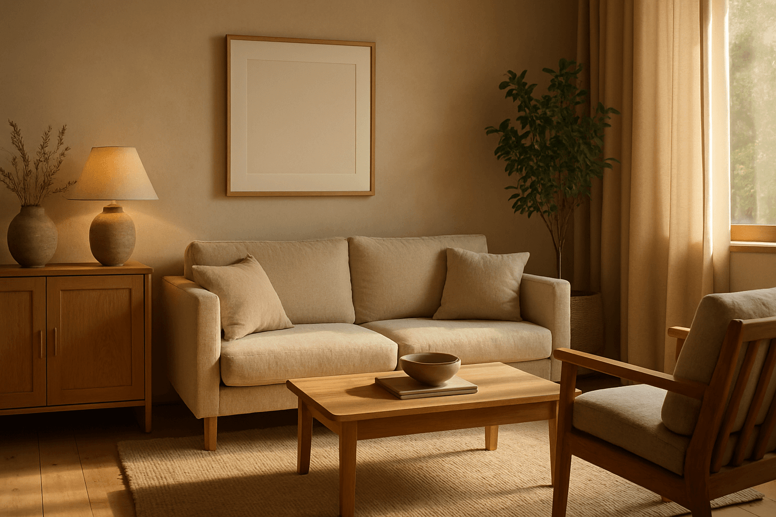
The Muted Earth Tone Palette is a popular color approach in AI image generation that emphasizes soft, natural hues inspired by the earth. These colors include warm browns, olive greens, beiges, and greys, all presented in subdued saturation levels to avoid overly bright or intense visuals. Using this palette creates images that feel organic, calm, and stylish, making it ideal for modern editorial content, lifestyle photography, and interior design renders. By focusing on muted tones, the images exude refinement and subtlety, appealing to viewers seeking sophistication without harsh contrasts. Incorporating this palette into your AI prompts helps generate visuals with a cohesive and naturalistic color balance.
Natural Earthy Palette
The Natural Earthy Palette keyword enriches AI-generated images by guiding color selection toward warm, organic tones rooted in nature. This palette includes shades seen in earth, rocks, foliage, and natural fibers, lending authenticity and a grounded feel. Ideal for scenes emphasizing calmness, rustic settings, or eco-friendly themes, it helps create visuals free from artificial harshness or bright synthetic colors. Using this palette infuses images with softness and understated elegance, matching trends favoring sustainability and natural beauty in design and advertising.
Deep Jewel Tones
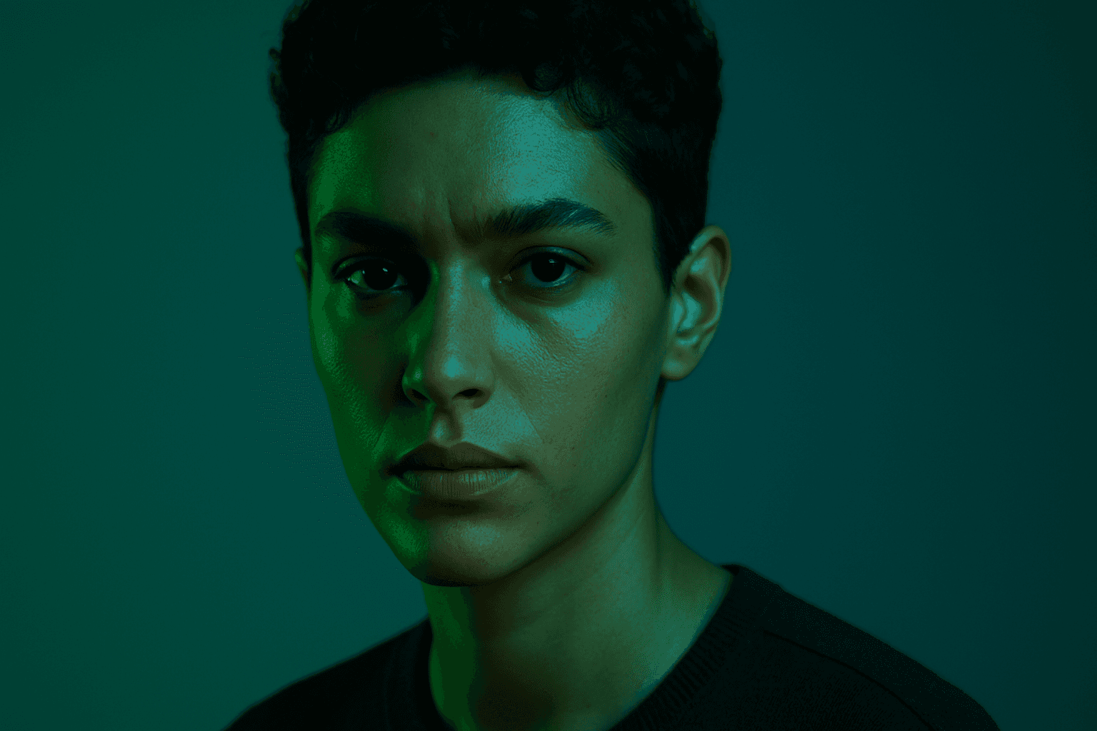
Deep jewel tones are a color category that draws inspiration from the vibrant and saturated hues of gemstones such as emeralds, sapphires, rubies, and amethysts. Using these colors in AI-generated images results in visuals that feel elegant, deep, and luxurious. The intense saturation combined with a natural richness adds emotional depth and visual interest without overwhelming the composition. This palette is especially effective for creating sophisticated editorial portraits, stylish fashion imagery, and premium product photography. By specifying 'deep jewel tones' in prompts, artists and creators can reliably evoke a refined atmosphere with distinctive, eye-catching colors.
Monotone Blue Palette
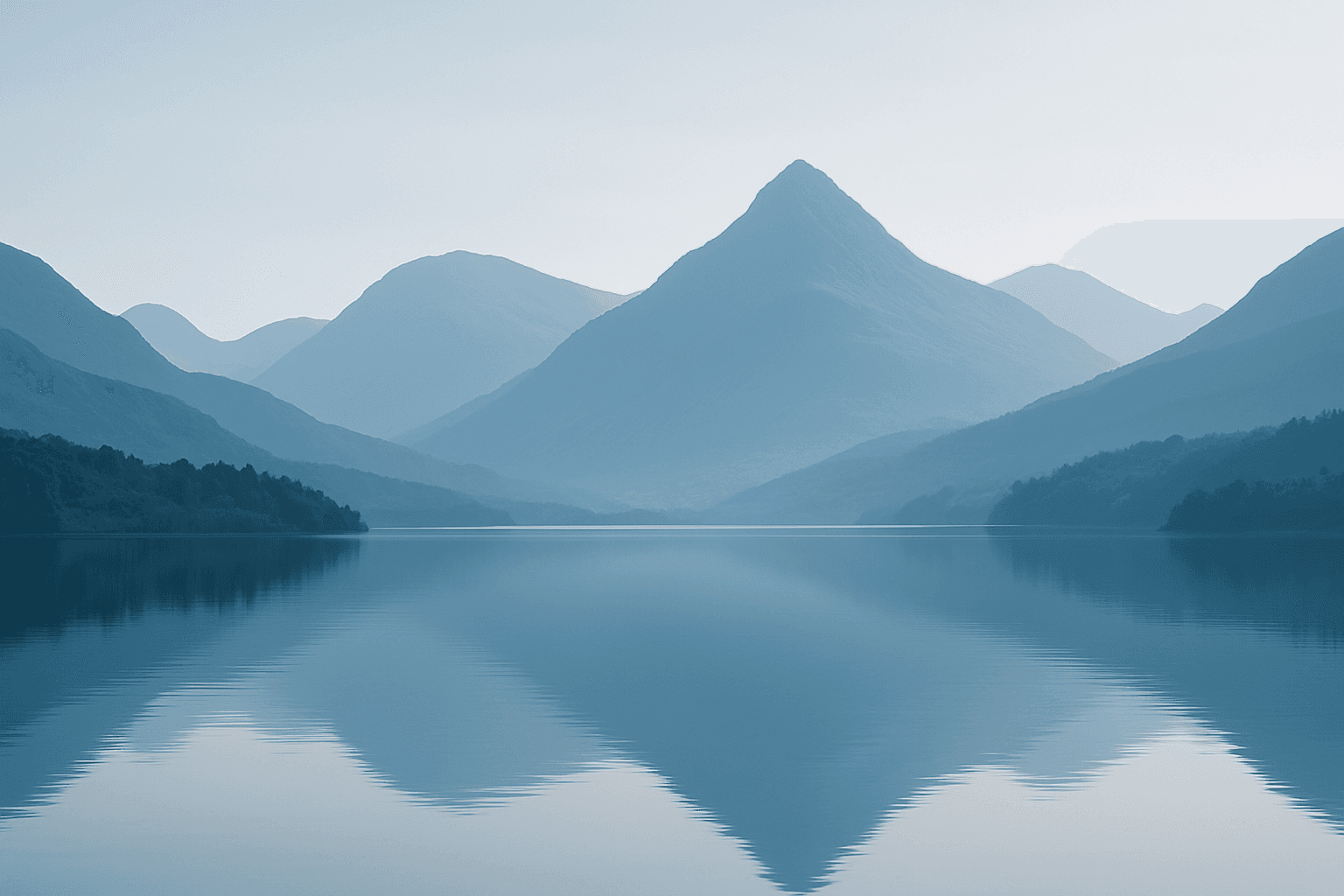
The Monotone Blue Palette is a specialized coloring style used in AI-generated imagery that embraces blue tones exclusively, from pale icy blues to deep navy. This approach simplifies color complexity while adding a sophisticated, calming atmosphere to an image. It is ideal for creative projects necessitating mood-driven visuals or stylistic consistency. Incorporating this palette into prompts helps artists, designers, and marketers create images that evoke tranquility, stability, and trustworthiness. The technique fits a variety of themes including landscapes, portraits, and abstract compositions, providing a modern, refined aesthetic that stands out due to its monochromatic elegance.
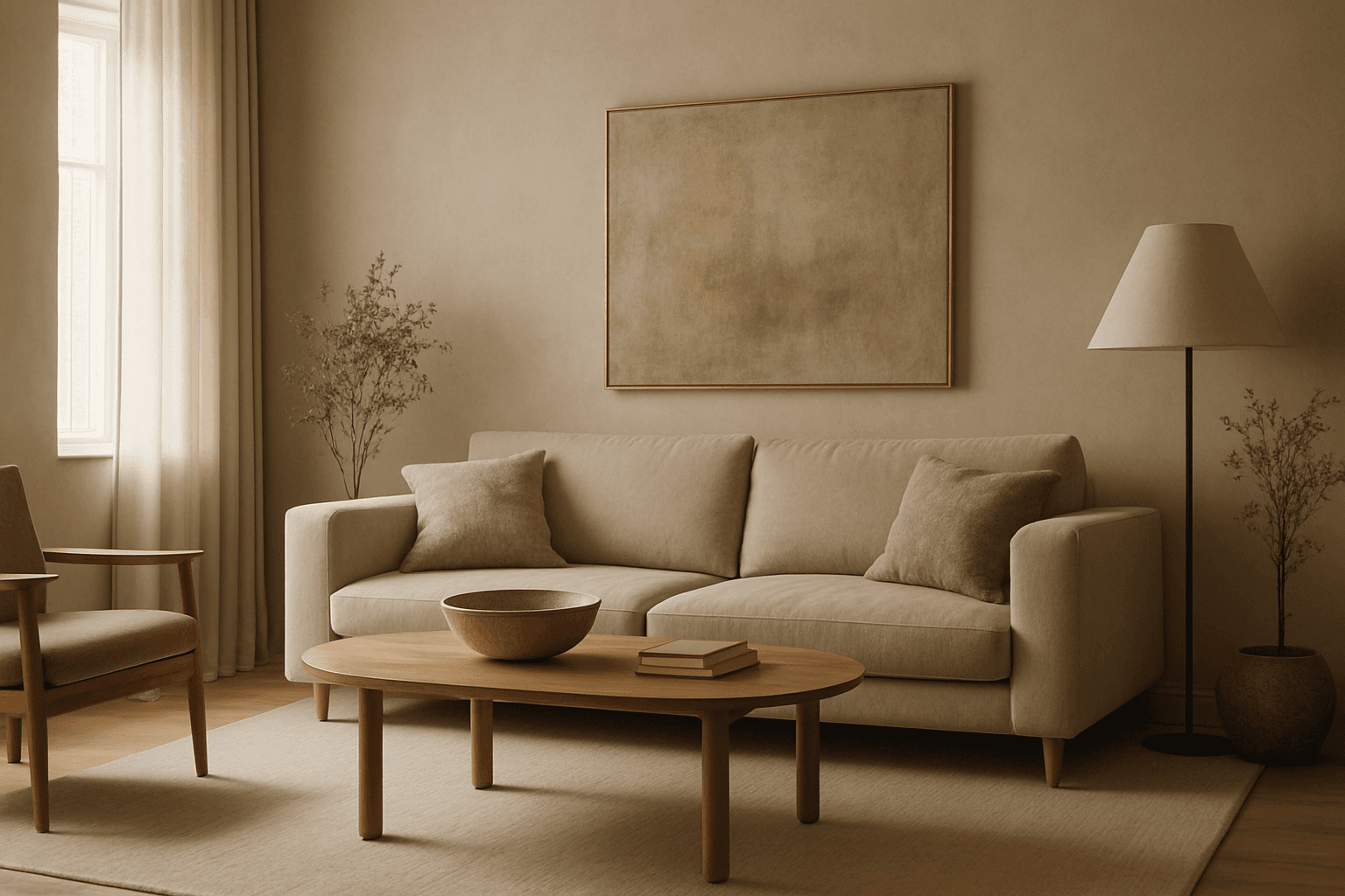
Muted Earth Tone Colors
Muted earth tone colors encapsulate a palette inspired by nature’s subtle and calming shades such as soft browns, gentle greens, warm ochres, and quiet grays. When integrated into AI image prompts, these colors help generate images that feel organic, grounded, and harmonious, making them ideal for designs seeking understated elegance or a natural aesthetic. This approach avoids harsh contrasts and bright tones, providing visuals that are soothing and visually balanced. Such color schemes are especially useful in editorial photography, interior design renderings, and lifestyle imagery, where authenticity and warmth are key. Utilizing these tones can transform generic visuals into cohesive, premium-feeling compositions that align with modern aesthetic trends.
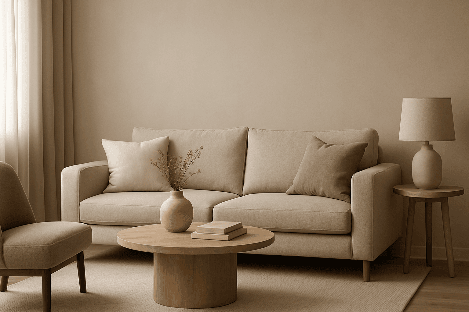
Muted Neutral Palette
The Muted Neutral Palette is an essential color theme used widely in design, photography, and digital imagery to produce a subtle, refined look. These colors lack vivid saturation and strong contrasts, resulting in images that feel calm, natural, and versatile. In AI-driven image generation, specifying a Muted Neutral Palette guides the model to avoid vibrant, saturated colors, focusing on softness and timelessness. It supports creating visuals that blend seamlessly in editorial, fashion, interior, and product contexts where sophistication and neutrality are paramount. This palette is particularly suited for minimalist compositions where color draws attention without overwhelming the scene.