Natural Earthy Palette
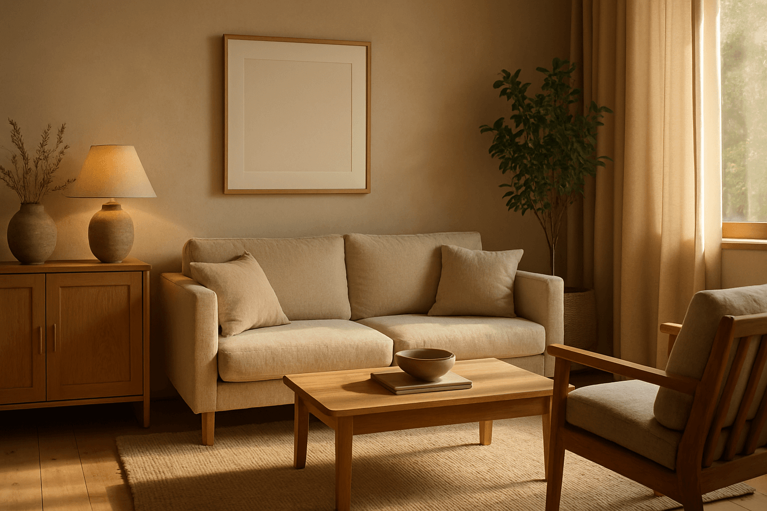
The Natural Earthy Palette keyword enriches AI-generated images by guiding color selection toward warm, organic tones rooted in nature. This palette includes shades seen in earth, rocks, foliage, and natural fibers, lending authenticity and a grounded feel. Ideal for scenes emphasizing calmness, rustic settings, or eco-friendly themes, it helps create visuals free from artificial harshness or bright synthetic colors. Using this palette infuses images with softness and understated elegance, matching trends favoring sustainability and natural beauty in design and advertising.
Definition
The Natural Earthy Palette is a color theme in AI image creation that focuses on warm, muted tones derived from nature such as browns, ochres, greens, and creams. When included in a prompt, it steers the model to render colors and lighting that simulate natural materials like soil, clay, wood, and foliage. This results in images with an organic and grounded feel, avoiding bright or artificial colors which might disrupt realism or subtle moods.
Prompt Formula
Using Natural Earthy Palette within your prompts can enhance realism and create inviting atmospheres. Combine it with environment or subject descriptors to perfect outputs. Example formula structures:
- "[Subject] in natural earthy palette, warm ambient light, soft shadows"
- "[Scene] featuring natural earthy palette tones, rustic textures, gentle diffused sunlight"
- "[Object] composed with natural earthy palette colors, matte finish, subtle depth"
Best Use Cases
- Lifestyle imagery emphasizing organic or eco-conscious branding
- Interior visuals highlighting wood, stone, and natural fabrics
- Editorial illustrations focusing on nature, sustainability, or wellness topics
Creative Variations
To avoid repetitive imagery with the Natural Earthy Palette, experiment by altering lighting, texture, and composition as follows:
- Add soft morning or golden hour lighting to enhance warmth
- Incorporate contrasting muted blues or grays for complementary accents
- Use close-up details of natural materials with earthy colors
- Apply shallow depth of field for intimate, textured effects
Industry Applications
The Natural Earthy Palette is widely used across commercial sectors for its approachable and authentic feel:
- Advertising campaigns for natural skincare and wellness brands
- Ecommerce presentations of sustainable fashion and handcrafted accessories
- Interior design mood boards, showcasing rustic and organic material palettes
Common Mistakes
Prompt writers sometimes misuse the Natural Earthy Palette by:
- Overloading scenes with too many contrasting colors diluting the earthy effect
- Forcing unnatural saturation levels leading to unrealistic colors
- Ignoring material textures which are vital to convey earthiness and depth
Advanced Techniques
Experienced prompt engineers can refine Natural Earthy Palette usage by combining it with:
- Precise lighting constraints, e.g., 'soft dappled forest light'
- Material-focused modifiers like 'matte clay', 'weathered wood', or 'raw linen'
- Color grading instructions such as 'subtle warm tone mapping' to unify image hues
FAQ
Can the Natural Earthy Palette be combined with vibrant colors?
While vibrant colors can be added as accents, the core of the Natural Earthy Palette focuses on muted, warm tones. Too much vibrancy can reduce the natural, organic feel that this palette aims to achieve.
Is the Natural Earthy Palette suitable for modern tech product imagery?
Generally, this palette suits natural, organic, or rustic themes better than high-tech or futuristic products, which often use cooler or more saturated palettes.
Continue Exploring
Related Prompts
Earthy Warm Tones
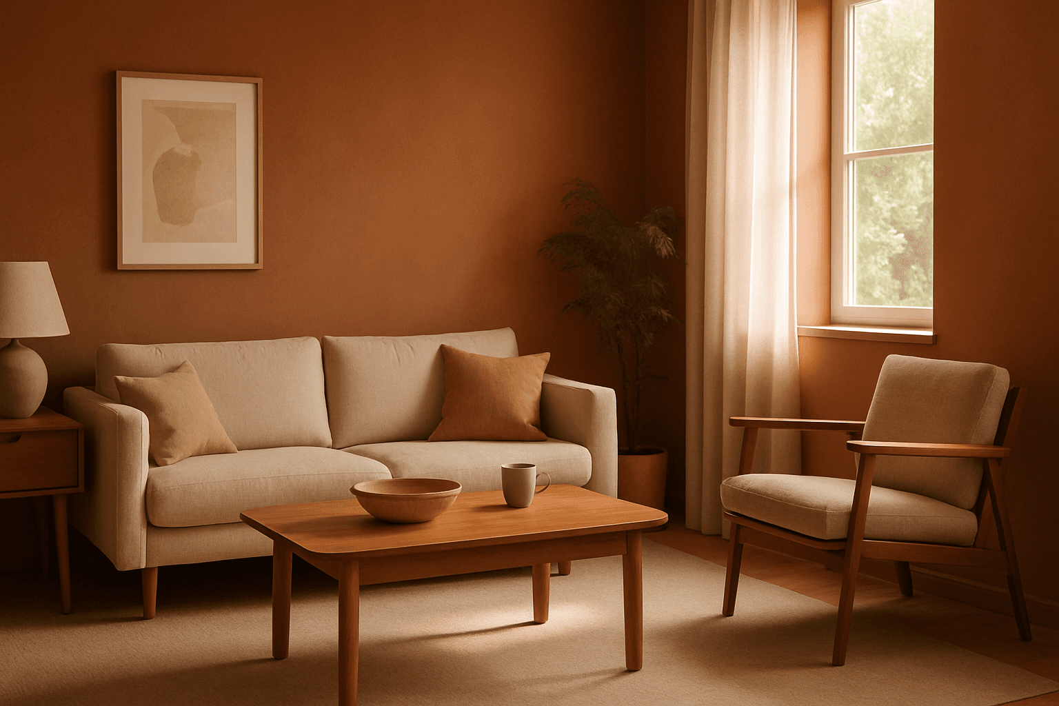
Using Earthy Warm Tones in AI image generation brings a cozy and organic aesthetic to your visuals. This color keyword shifts the palette toward natural and muted warm colors that recall the earth's rich textures, often creating a calm and inviting mood. Ideal for images that require realistic materials and depth, these tones lend a premium, editorial polish without harsh contrasts. When combined with refined lighting and subtle depth, images gain a tactile, authentic feel, suitable for editorial hero imagery or sophisticated product presentations.
Warm Neutral Palette
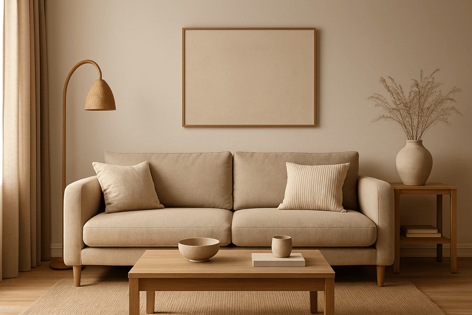
The Warm Neutral Palette is a popular color scheme choice in design and AI-generated imagery for its timeless and soothing qualities. This palette combines warm earthy tones with soft neutrals, producing images that feel natural and approachable. Incorporating warm neutrals can enhance mood by bringing subtle warmth and comfort to visuals without overpowering them. When added to AI prompts, it guides the model to emphasize harmonious colors that evoke calmness and sophistication. The palette works well across various genres, including lifestyle, interiors, fashion, and nature themes, helping create polished and refined visuals suitable for editorial or commercial use.

Muted Earth Tone Palette
The Muted Earth Tone Palette is a popular color approach in AI image generation that emphasizes soft, natural hues inspired by the earth. These colors include warm browns, olive greens, beiges, and greys, all presented in subdued saturation levels to avoid overly bright or intense visuals. Using this palette creates images that feel organic, calm, and stylish, making it ideal for modern editorial content, lifestyle photography, and interior design renders. By focusing on muted tones, the images exude refinement and subtlety, appealing to viewers seeking sophistication without harsh contrasts. Incorporating this palette into your AI prompts helps generate visuals with a cohesive and naturalistic color balance.
Muted Earth Tone Colors
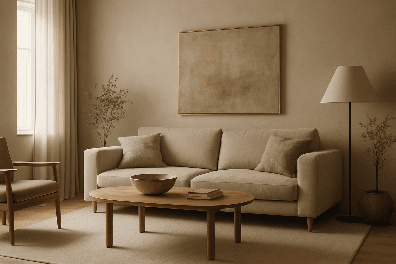
Muted earth tone colors encapsulate a palette inspired by nature’s subtle and calming shades such as soft browns, gentle greens, warm ochres, and quiet grays. When integrated into AI image prompts, these colors help generate images that feel organic, grounded, and harmonious, making them ideal for designs seeking understated elegance or a natural aesthetic. This approach avoids harsh contrasts and bright tones, providing visuals that are soothing and visually balanced. Such color schemes are especially useful in editorial photography, interior design renderings, and lifestyle imagery, where authenticity and warmth are key. Utilizing these tones can transform generic visuals into cohesive, premium-feeling compositions that align with modern aesthetic trends.
Morandi Palette
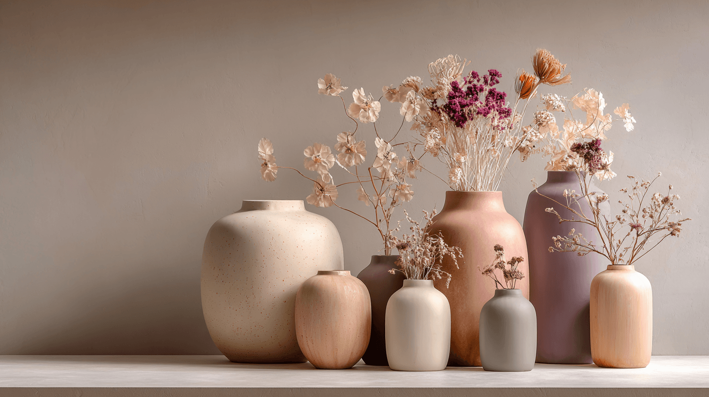
Morandi Palette is a color keyword inspired by the quiet, dusty tones associated with painter Giorgio Morandi. In AI image prompts, it usually points the model toward muted, low-saturation colors such as dusty rose, warm gray, clay, sage, beige, soft blue, faded mauve, and stone. The effect is refined, calm, and slightly editorial. This palette is useful when you want an image to feel sophisticated without becoming cold or overly minimal. For beginners, Morandi Palette is a practical way to control color harmony. It can make a scene feel more tasteful, cohesive, and brand-ready, especially when default AI colors look too bright or artificial.
Muted Neutral Palette
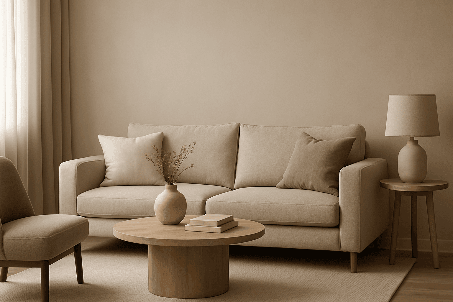
The Muted Neutral Palette is an essential color theme used widely in design, photography, and digital imagery to produce a subtle, refined look. These colors lack vivid saturation and strong contrasts, resulting in images that feel calm, natural, and versatile. In AI-driven image generation, specifying a Muted Neutral Palette guides the model to avoid vibrant, saturated colors, focusing on softness and timelessness. It supports creating visuals that blend seamlessly in editorial, fashion, interior, and product contexts where sophistication and neutrality are paramount. This palette is particularly suited for minimalist compositions where color draws attention without overwhelming the scene.