Color Saturation Control
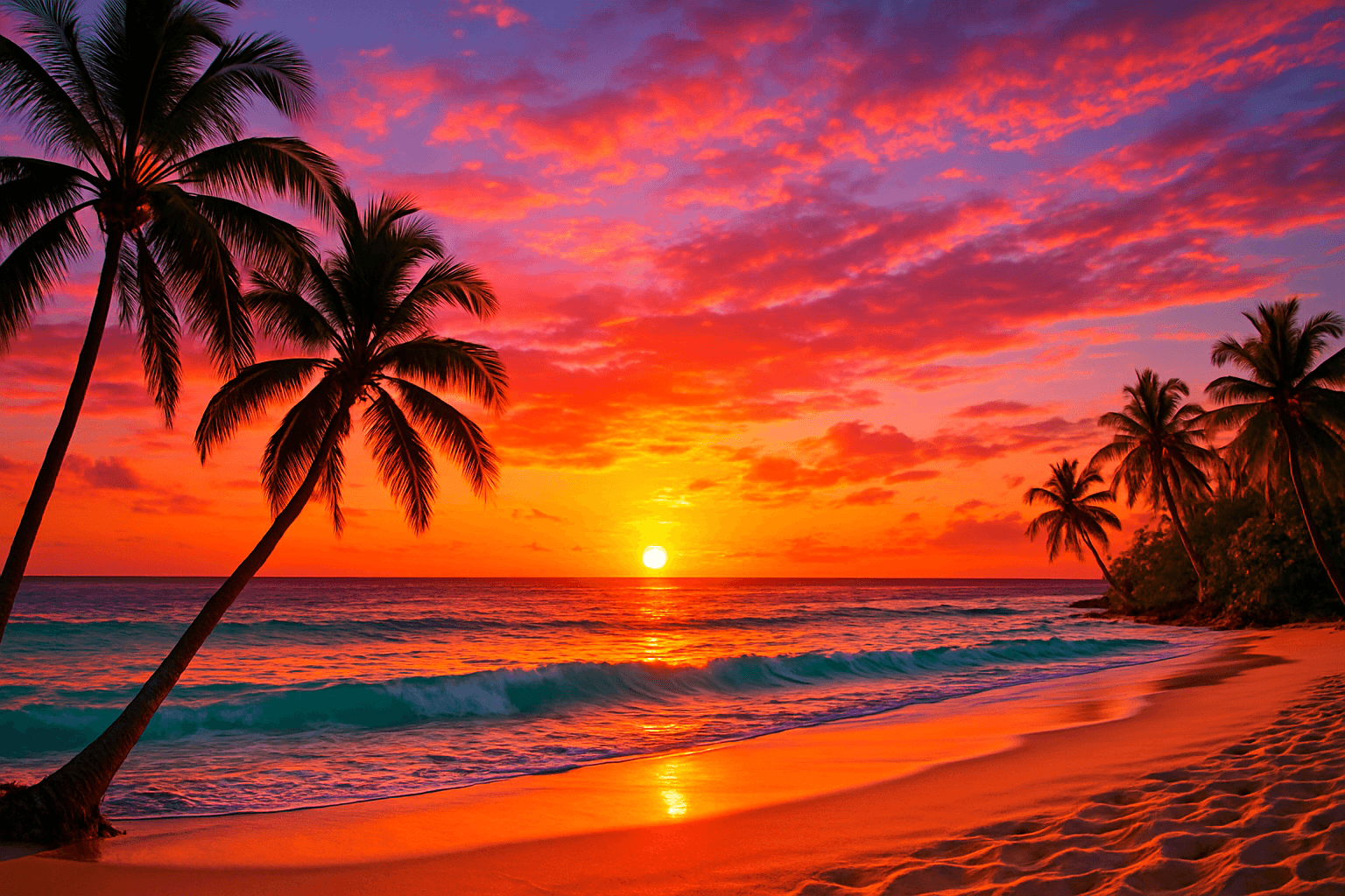
Color Saturation Control is a critical keyword in AI image generation that governs the vibrancy and intensity of colors within the resulting artwork. By adjusting saturation through prompt instructions, users can shift the emotional tone and visual clarity of images — from bright, eye-catching compositions to subtle, understated palettes. This control helps in creating images that fit diverse artistic intentions, whether aiming for hyper-realism, stylized painting, or atmospheric photography. Proper use of saturation modifiers enhances the mood and clarity, making Color Saturation Control indispensable in crafting compelling AI visuals.
Definition
Color Saturation Control in AI image generation means managing the intensity of colors to range from vivid and bright to subdued and pastel. It changes how lively or muted colors appear, impacting the image’s emotional tone and realism. In prompts, it is achieved by including terms like "high saturation," "muted colors," or "low saturation," guiding the AI in color rendering.
Prompt Formula
A common formula involves combining descriptive color terms with saturation modifiers for clarity: - Subject + Environment + ("vibrant colors" | "high saturation" | "muted tones" | "low saturation") + Style tags Examples: - "A lush forest, vibrant colors, hyperrealistic" - "Historic street, muted tones, vintage photograph style"
- Subject + Scene + Saturation Descriptor + Style
- "vibrant colors" or "high saturation" for intense hues
- "muted tones" or "low saturation" for subtle colors
Best Use Cases
- Marketing visuals requiring colorful appeal
- Moody or nostalgic artistic projects
- Natural scenes needing realistic color balance
Advanced Techniques
Experienced users can combine Color Saturation Control with light and contrast adjustments for nuanced effects. For example, pairing "high saturation" with "soft lighting" can preserve brightness without oversaturation. Using saturation levels alongside style references (e.g., "Impressionist with desaturated palette") crafts unique moods. Constraints like "avoid oversaturation" or "balanced saturation" help prevent unnatural colors in complex scenes.
- Combine with lighting terms for balance
- Pair with style-specific saturation references
- Use constraints to prevent color blowouts
Professional Workflow
Begin by defining the target mood and color intensity in the brief. Generate initial images with varied saturation descriptors to test outcomes. Review images focusing on color vibrancy and naturalness. Select samples that fit the brief, then refine prompts by specifying exact saturation descriptors or combining related parameters like lighting. Finalize images by adjusting only minor saturation details in post-processing if necessary.
- Brief mood and saturation goals
- Generate iterative samples with different saturation levels
- Select best results and refine prompt
- Final post-processing adjustments
Related Styles
- Vibrant Color Palette
- Muted Pastel Aesthetic
- Film Noir Desaturation
FAQ
How does color saturation affect the mood of an AI-generated image?
Higher saturation tends to create energetic, lively moods, while lower saturation can evoke calmness, nostalgia, or a vintage feel.
Can I control saturation precisely in AI prompts?
While exact numeric control is limited, using descriptive terms like "high saturation," "muted colors," or "balanced saturation" effectively guides the AI's color intensity.
Continue Exploring
Related Prompts

High Saturation Color Palette
Utilizing a High Saturation Color Palette in AI image generation transforms visuals into bold, lively compositions that capture attention instantly. This approach amplifies the color intensity beyond natural or muted levels, creating a vivid scene bursting with hues that feel powerful and immersive. Often chosen for marketing materials, modern art visuals, and stylized photography, artworks generated with high saturation evoke energetic and emotional responses. When combined thoughtfully with lighting, texture, and composition, it creates a striking balance of vibrancy and clarity, making it ideal for covers, header images, and creative projects needing dynamic coloring.
Color Temperature Adjustment
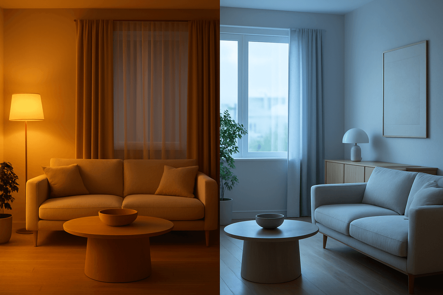
Color Temperature Adjustment is a vital tool in AI image prompt crafting, allowing creators to fine-tune the emotional and visual tone of their images. By manipulating color temperature, users can invite feelings of warmth and comfort or convey crispness and coolness, enhancing the context or story. This adjustment effectively tightens the connection between an image’s lighting environment and its intended impression, such as a warm sunset scene or a cool winter morning. Understanding and applying color temperature improves realism and artistic expression in many visual projects, from photography-style renders to stylized artworks.

Saturated Color Splash
The Saturated Color Splash keyword is a powerful prompt modifier used in AI-driven creative workflows to generate images bursting with vibrant, intense colors and striking splash effects. It commands the AI to amplify the chroma and saturation of the color palette, producing visuals that are lively and compelling. These images typically showcase paint splashes or liquid color bursts that evoke motion and energy, making them ideal for dynamic compositions. Using this keyword enriches the visual storytelling, drawing viewers’ attention through high-impact color contrasts and expressive strokes. This effect suits various digital art applications, advertising visuals, and editorial imagery where boldness and vibrancy are desired.
Earthy Warm Color Scheme
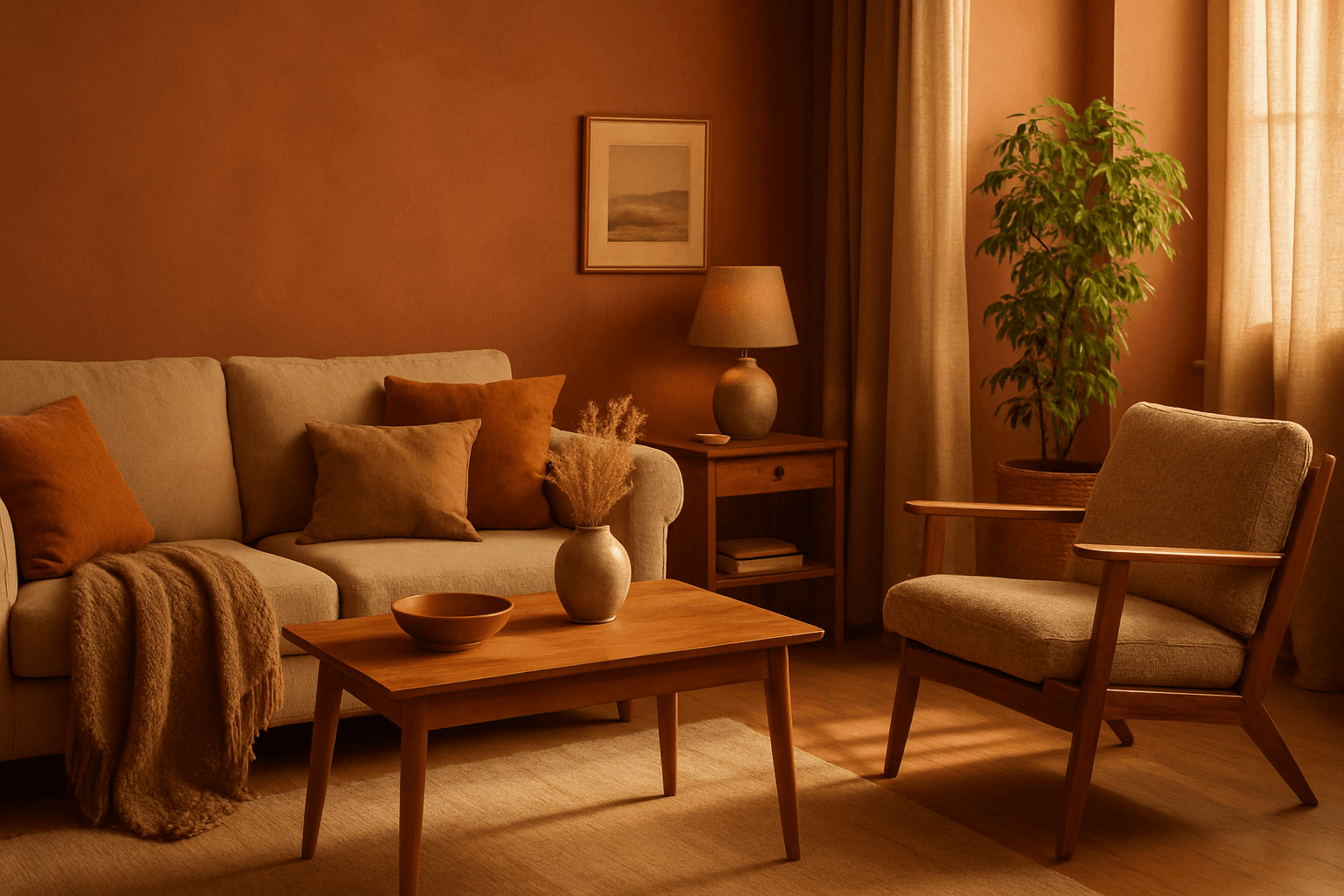
The Earthy Warm Color Scheme is a popular choice for artists and designers aiming to create images that feel natural, comforting, and connected to the environment. By focusing on warm, muted earth tones, this scheme lends a timeless aesthetic suited for a variety of subjects, including landscapes, portraits, interiors, and product shots. Using this palette in AI image prompts can help achieve visuals that emphasize quiet warmth and natural beauty, often evoking rustic charm or bohemian moods. It's well-suited for editorial photography, lifestyle branding, and environmental themes, enhancing images with a sophisticated yet approachable mood.

Soft Muted Color Palette
Using a Soft Muted Color Palette in AI-generated imagery influences the mood and style by incorporating subdued and delicate colors. This approach conveys sophistication, tranquility, and natural beauty, making visuals suitable for subtle branding, lifestyle photography, and editorial contexts. It avoids bright or saturated colors, instead emphasizing nuance and refinement. Artists and designers use it to evoke feelings of warmth, nostalgia, or modern minimalism, enhancing the visual narrative through controlled color harmony and soft contrasts.

Pastel Gradient Color Scheme
The pastel gradient color scheme is popular in AI-generated art for its serene and inviting aesthetic. It involves the blending of light, desaturated pastel tones in gradual transitions, which can add depth and softness to visuals without overwhelming details. Using this keyword in prompts helps create backgrounds, themes, or focal areas that evoke feelings of calmness and subtle sophistication. This scheme often suits digital art, branding visuals, and UI elements where gentle color progression supports readability and aesthetic appeal. Its balanced and harmonious style enhances mood and focuses attention, making it a versatile choice in many design contexts.