Color Temperature Adjustment
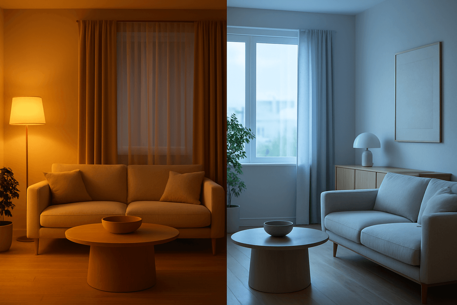
Color Temperature Adjustment is a vital tool in AI image prompt crafting, allowing creators to fine-tune the emotional and visual tone of their images. By manipulating color temperature, users can invite feelings of warmth and comfort or convey crispness and coolness, enhancing the context or story. This adjustment effectively tightens the connection between an image’s lighting environment and its intended impression, such as a warm sunset scene or a cool winter morning. Understanding and applying color temperature improves realism and artistic expression in many visual projects, from photography-style renders to stylized artworks.
Definition
Color Temperature Adjustment in AI image prompts means altering the warmth or coolness in an image's color tone. It shifts the scene lighting effect, influencing the emotional feel and atmosphere—warmer tones add yellows and reds, cooler tones add blues. This change helps control mood and realism in AI-generated visuals.
Visual Characteristics
- Warm images show golden, amber, or orange highlights creating cozy atmospheres.
- Cool images feature bluish or cyan tones producing calm or futuristic moods.
- Neutral temperature maintains balanced, natural daylight color representation.
Prompt Formula
To build prompts incorporating Color Temperature Adjustment, combine tone descriptors with scene or subject details for clarity. Use adjectives like 'warm', 'cool', or specify 'color temperature adjustment to warm/cool'. Examples include referencing time of day (golden hour, twilight) or light sources (daylight, tungsten).
- <subject>, warm color temperature adjustment, soft golden hour lighting
- <scene>, cool color temperature adjustment, daylight with blue shadows
- <environment>, neutral color temperature, balanced natural lighting
Best Use Cases
- Portraits requiring mood lighting like sunrise warmth or evening coolness.
- Interior scenes where lighting tone sets ambiance for design presentations.
- Landscape and nature compositions emphasizing time of day or weather conditions.
Related Styles
- Warm Lighting
- Cool Lighting
- White Balance Adjustment
Model-Specific Tips
Most AI image generation models respond well to explicit temperature-related adjectives and lighting descriptors. For best results, clearly pair color temperature phrases with contextual details like time of day or light source type. Avoid ambiguous wording; specify 'warm' or 'cool' color temperature rather than vague terms. Experiment with modifiers like 'soft' or 'harsh' to influence the intensity of the temperature effect. Also, consider combining with related keywords such as 'golden hour' or 'blue hour' for nuanced lighting.
FAQ
How does color temperature adjustment affect the mood of an AI-generated image?
Adjusting color temperature changes the warmth or coolness of the image's overall tone, influencing emotional perception. Warm temperatures evoke comfort and intimacy, while cool temperatures feel calm, distant, or modern.
Can I combine color temperature adjustment with other lighting effects in prompts?
Yes, combining color temperature with lighting conditions like golden hour, soft shadows, or artificial light sources helps achieve more realistic and specific atmospheres.
Is color temperature adjustment recognized by all AI image generation models?
Most modern models understand temperature-related descriptors when clearly stated, though effectiveness can vary depending on the model's training and prompt sensitivity.
Continue Exploring
Related Prompts
Color Saturation Control
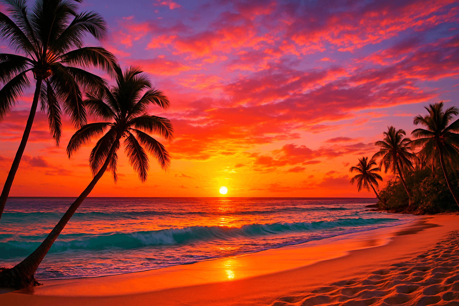
Color Saturation Control is a critical keyword in AI image generation that governs the vibrancy and intensity of colors within the resulting artwork. By adjusting saturation through prompt instructions, users can shift the emotional tone and visual clarity of images — from bright, eye-catching compositions to subtle, understated palettes. This control helps in creating images that fit diverse artistic intentions, whether aiming for hyper-realism, stylized painting, or atmospheric photography. Proper use of saturation modifiers enhances the mood and clarity, making Color Saturation Control indispensable in crafting compelling AI visuals.

Golden Hour Color Grading
Golden Hour Color Grading is a popular technique used in AI-generated imagery to evoke the warmth and nuanced lighting of early morning or late afternoon sun. By incorporating this keyword, artists and designers can infuse a sense of natural beauty, highlight textures subtly, and create emotionally engaging visuals. This color grading enriches photographic or pictorial prompts by adding depth through soft shadows and warm highlights, transforming otherwise flat images into luminous and aesthetically pleasing works that capture a fleeting moment of natural light and atmosphere.
Balanced Color Temperature
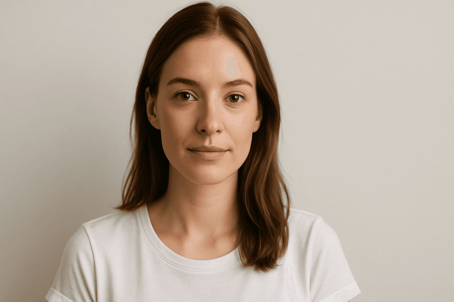
Balanced Color Temperature in AI-generated images ensures that lighting appears natural and true-to-life, avoiding overpowering warm or cool tones. This quality impacts the mood and realism of visuals by maintaining a neutral color balance, making images suitable for professional presentations, product photography, and editorial content. By controlling color temperature, artists and creators can highlight details without unnatural tints, producing polished and visually coherent artworks.

High Saturation Color Palette
Utilizing a High Saturation Color Palette in AI image generation transforms visuals into bold, lively compositions that capture attention instantly. This approach amplifies the color intensity beyond natural or muted levels, creating a vivid scene bursting with hues that feel powerful and immersive. Often chosen for marketing materials, modern art visuals, and stylized photography, artworks generated with high saturation evoke energetic and emotional responses. When combined thoughtfully with lighting, texture, and composition, it creates a striking balance of vibrancy and clarity, making it ideal for covers, header images, and creative projects needing dynamic coloring.
Monochrome Warm Palette
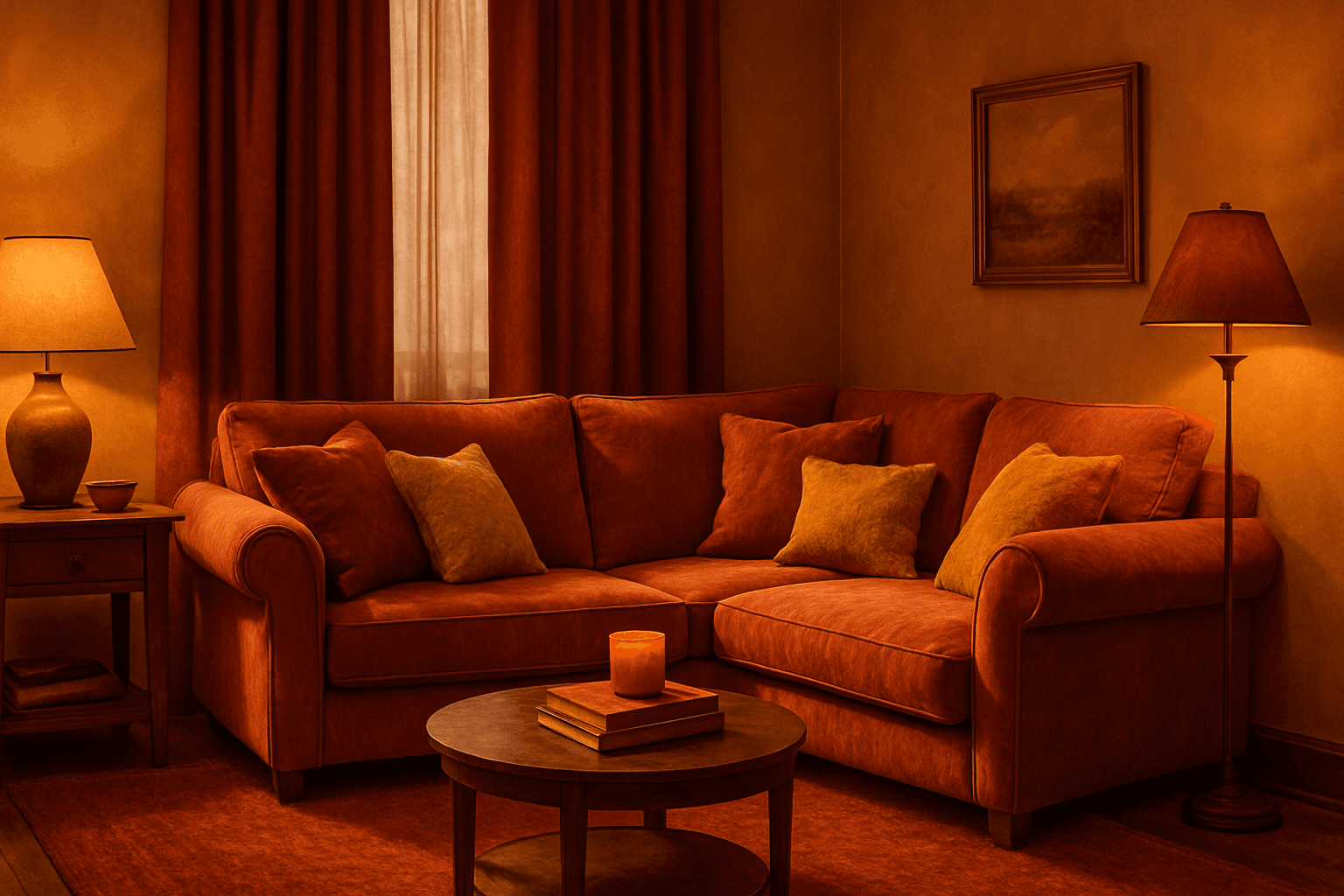
Applying a Monochrome Warm Palette in AI-generated images sets a unified, warm tone that evokes feelings of comfort, energy, and passion. This approach simplifies the color scheme by utilizing only warm colors that range from muted tans and terracottas to vibrant oranges and reds. It directs the AI image generation to avoid cool colors, keeping the visuals coherent and emotionally resonant. The result is a natural, aesthetically pleasing image with subtle depth, ideal for modern editorial designs or lifestyle photography that seeks to communicate warmth and intimacy without overwhelming complexity.

Gradient Sky Colors
Incorporating Gradient Sky Colors into AI-generated images significantly enhances the atmospheric quality and visual depth of outdoor scenes. By blending multiple hues in a smooth, gradual fashion, these skies offer a natural yet captivating backdrop that supports various themes such as serenity, romance, or drama. This keyword is especially useful in settings featuring landscapes, cityscapes, or fantasy environments, enriching the emotional tone of an image. Using gradient skies in prompts allows creators to move beyond flat or uniform color skies, enabling more dynamic and mood-driven outputs that resonate well in editorial, advertising, and artistic contexts.