Analog Film Color Palette
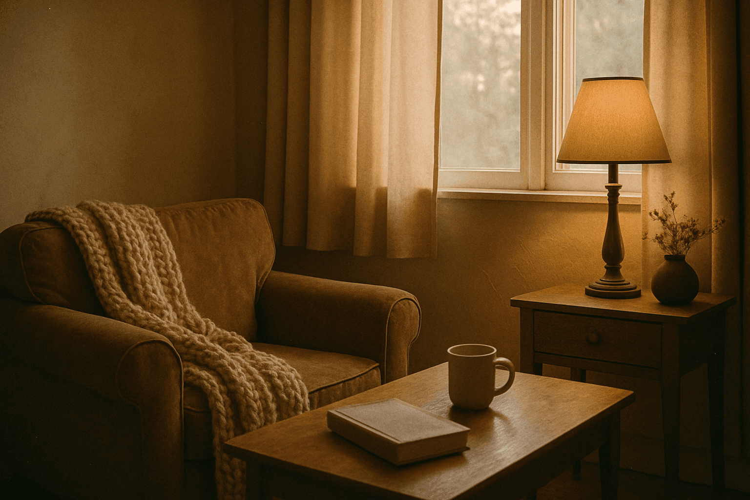
The Analog Film Color Palette is a popular keyword in AI image generation, used to achieve an aesthetic inspired by classic analog photography. It encourages AI models to emulate the color tones of vintage film rolls, incorporating soft reds, dusty blues, faded greens, and warm beige hues. This palette adds emotional depth and a nostalgic atmosphere to images, evoking memories of the past with subtle imperfections like gentle grain and nuanced light scattering. It is highly valued for creating editorial looks, lifestyle imagery, and artistic photographs that stand out for their authenticity and mood. Incorporating this palette can elevate digital images beyond bright, clinical colors toward more tactile, artistic visuals.
Definition
The Analog Film Color Palette specifies a color scheme inspired by traditional film photography, emphasizing muted, warm, and slightly desaturated tones to emulate the look of old analog film stocks. Including this in an AI prompt tells the model to adjust colors, contrast, and saturation to achieve a nostalgic, vintage feel, often accompanied by subtle grain and natural light effects.
Prompt Formula
To incorporate the Analog Film Color Palette effectively, combine descriptive elements about lighting and mood with color-specific terms and film references. For example, start with your subject and setting, add "analog film color palette," then specify tones like "warm muted colors," "soft contrast," or reference popular film stocks.
- [Subject] + analog film color palette + warm muted tones + subtle grain
- [Scene] + analog film color palette + faded colors + soft lighting
- [Composition] + analog film color palette + nostalgic mood + film grain effect
Best Use Cases
This color palette excels in several contexts where vintage aesthetic and emotional warmth are desired.
- Creating lifestyle photography that recalls past decades
- Producing editorial portraits with timeless and flattering tones
- Developing atmospheric art or narrative scenes that feel organic and handcrafted
Industry Applications
The Analog Film Color Palette is widely used across several commercial fields to evoke nostalgia and authenticity.
- Fashion advertising campaigns emphasizing retro or classic styles
- Editorial photography for magazines that value storytelling and mood
- Social media content development for brands targeting lifestyle and heritage consumers
Common Mistakes
A frequent error is overusing saturation or contrast adjustments alongside this palette, which negates its muted, natural character. Another pitfall is adding grain excessively, making the image appear noisy rather than delicately textured. Avoid generic descriptions like "vintage colors" without clarifying the precise color tone or film reference, which can cause AI to produce inconsistent results.
- Over-saturating colors, losing the muted effect
- Applying too much digital grain, creating noise
- Using vague prompts without detailed color temperature or film style
Advanced Techniques
Experienced users can combine the Analog Film Color Palette with lighting or texture modifiers to deepen realism. For example, pairing with "golden hour lighting" enhances warmth, while adding "soft film scratches" introduces authentic imperfection. Using negative prompt terms like "overprocessed" prevents artificial sharpness. Layering it with stylistic keywords such as "cinematic" or "moody shadows" crafts sophisticated artistic imagery.
- Combine with golden hour lighting for warm highlights
- Add soft film scratches or dust for vintage texture
- Use negative terms like overprocessed or harsh lighting to maintain analog subtlety
- Pair with cinematic or moody shadows to deepen atmosphere
Professional Workflow
Start by clearly defining the image’s concept and desired mood, then draft prompts using the Analog Film Color Palette combined with setting-appropriate light and style descriptors. Generate multiple variations to explore tonal range and grain effects. Select images that preserve detail while evoking vintage warmth, then fine-tune color grading or grain intensity in post-processing software. Validate final outputs for natural-looking textures and consistent mood before deployment.
- Concept briefing with mood and vintage emphasis
- Prompt drafting combining analog film palette and lighting
- Batch generation of image variations
- Careful selection emphasizing natural warmth and grain
- Post-process refinement of tonal balance and texture
FAQ
Can I use the Analog Film Color Palette with any AI image model?
Yes, most AI image generation models support color palette prompts, but results may vary slightly. It’s best to test the palette with your preferred model and adjust wording accordingly.
How can I avoid unnatural color shifts when using this palette?
Specify additional lighting conditions and avoid mixing conflicting color modifiers. Use terms like 'warm muted tones' and 'soft contrast' to guide the AI toward harmonious results.
Continue Exploring
Related Prompts
Muted Pastel Color Palette
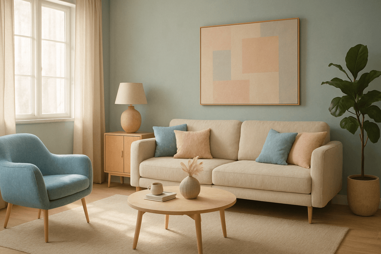
The muted pastel color palette blends the gentle softness of pastel tones with a restrained saturation level, resulting in colors that evoke tranquility and refinement. When integrated into AI image generation, these colors provide a versatile aesthetic that suits a variety of creative and commercial needs. This palette can transform images into visually soothing experiences, often appearing in editorial designs, fashion imagery, and lifestyle branding. It avoids the brightness and intensity typical of standard pastels, offering a more mature and elegant atmosphere. The muted pastels produce harmonious compositions by pairing subdued colors, ideal for designs requiring subtlety, sophistication, and approachability.

High Saturation Color Palette
Utilizing a High Saturation Color Palette in AI image generation transforms visuals into bold, lively compositions that capture attention instantly. This approach amplifies the color intensity beyond natural or muted levels, creating a vivid scene bursting with hues that feel powerful and immersive. Often chosen for marketing materials, modern art visuals, and stylized photography, artworks generated with high saturation evoke energetic and emotional responses. When combined thoughtfully with lighting, texture, and composition, it creates a striking balance of vibrancy and clarity, making it ideal for covers, header images, and creative projects needing dynamic coloring.

Subtle Gradient Color Blends
Subtle Gradient Color Blends are an essential visual technique in AI-generated imagery that enhance the overall composition and mood by incorporating gentle shifts between hues. These blends create a polished, professional look by avoiding abrupt color changes and enabling a seamless flow that can simulate natural lighting, shadows, or material surfaces. Using subtle gradients in prompts encourages AI models to produce images with refined color transitions that elevate the realism and elegance, making them perfect for backgrounds, product visualization, or editorial illustrations. Incorporating subtle color gradients helps establish depth while maintaining a clean and sophisticated style, highly valued in modern design and digital art.
Warm Earth Tone Palette
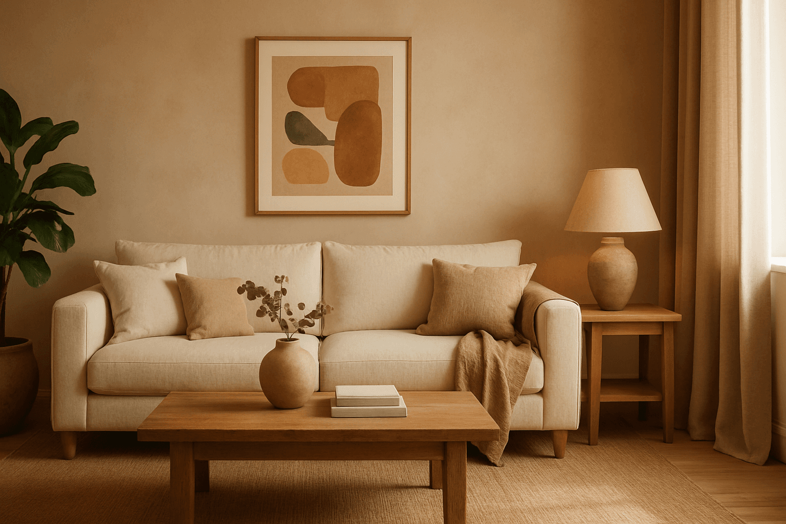
Using a Warm Earth Tone Palette in AI image generation brings a natural and inviting atmosphere to visuals. These tones emulate colors found in nature, such as clay, autumn leaves, and sunbaked earth, providing a grounded and calming aesthetic. Incorporating this palette into prompts encourages AI models to generate images that feel organic and warm, which is ideal for themes involving nature, rustic settings, comfort, and heritage. It helps create harmonious compositions that appear authentic and emotionally resonant, making the images suitable for lifestyle, interior design, and environmental storytelling.

Golden Hour Color Grading
Golden Hour Color Grading is a popular technique used in AI-generated imagery to evoke the warmth and nuanced lighting of early morning or late afternoon sun. By incorporating this keyword, artists and designers can infuse a sense of natural beauty, highlight textures subtly, and create emotionally engaging visuals. This color grading enriches photographic or pictorial prompts by adding depth through soft shadows and warm highlights, transforming otherwise flat images into luminous and aesthetically pleasing works that capture a fleeting moment of natural light and atmosphere.

Soft Muted Color Palette
Using a Soft Muted Color Palette in AI-generated imagery influences the mood and style by incorporating subdued and delicate colors. This approach conveys sophistication, tranquility, and natural beauty, making visuals suitable for subtle branding, lifestyle photography, and editorial contexts. It avoids bright or saturated colors, instead emphasizing nuance and refinement. Artists and designers use it to evoke feelings of warmth, nostalgia, or modern minimalism, enhancing the visual narrative through controlled color harmony and soft contrasts.