Golden Hour Color Grading
Golden Hour Color Grading is a popular technique used in AI-generated imagery to evoke the warmth and nuanced lighting of early morning or late afternoon sun. By incorporating this keyword, artists and designers can infuse a sense of natural beauty, highlight textures subtly, and create emotionally engaging visuals. This color grading enriches photographic or pictorial prompts by adding depth through soft shadows and warm highlights, transforming otherwise flat images into luminous and aesthetically pleasing works that capture a fleeting moment of natural light and atmosphere.

Definition
Golden Hour Color Grading represents the technique of adjusting image tones and lighting in an AI prompt to replicate the warm, glowing light found shortly after sunrise or before sunset. It enriches images with amber hues and soft shadows, creating a cinematic and inviting atmosphere that enhances natural beauty and depth.
Prompt Formula
Use combinations emphasizing warmth and softness to achieve the golden hour effect. For example, incorporate phrases like 'warm amber light,' 'soft glowing shadows,' 'golden hour glow,' and 'cinematic warm tones' alongside your main subject to reliably evoke this atmosphere.
- [subject] with warm amber light and golden hour glow
- Cinematic scene with soft glowing shadows and rich golden hues
- Portrait bathed in warm, soft light with subtle warm highlights
Best Use Cases
- Portraits and character renders with flattering warm skin tones
- Landscape scenes capturing dawn or dusk moods
- Product photography emphasizing rich textures with warm lighting
Industry Applications
Golden Hour Color Grading is widely used commercially to create emotionally engaging and visually rich content. In advertising, it enhances lifestyle and luxury product visuals, giving them a premium feel. Editorial imagery leverages its atmospheric warmth to tell compelling stories or set moods. E-commerce benefits from this grading by making product details pop with natural warmth, increasing buyer appeal across categories like fashion, beauty, and home decor.
- Advertising: luxury lifestyle and brand campaigns
- Editorial: magazine covers and feature spreads
- E-commerce: product photography with warm, inviting tones
Common Mistakes
A frequent error in prompts is over-saturating warm tones, resulting in unnatural, overly orange images that lose realism. Using vague descriptions like 'warm light' without specifying the golden hour context can lead to generic lighting. Also, neglecting shadow softness may create harsh contrasts that contradict the gentle golden hour aesthetic. To avoid these pitfalls, use well-defined phrases and balance color saturation with soft, diffuse shadows.
- Avoid excessive orange saturation that appears artificial
- Specify 'golden hour' to ensure warm yet natural tones
- Include soft shadows for authentic light diffusion
Advanced Techniques
Combine Golden Hour Color Grading with specific environment descriptors like 'misty morning' or 'sunset haze' to add atmospheric complexity. Use modifiers such as 'low contrast warm tones' or 'rich amber highlights with soft rim lighting' for nuanced output. Additionally, constraining color palettes to include deep golds, gentle oranges, and muted reds while limiting blues enhances cohesion. Use multi-prompt weighting to balance subtle warmth with texture detail.
- Merge with environmental effects (mist, haze) for mood
- Use contrast and highlight modifiers for refined control
- Control color palette to deepen warm tones without pushing saturation
Professional Workflow
Begin by clearly briefing the desired mood and lighting—specify golden hour natural light for warm ambience. Generate initial sets of images using a formulaic prompt that includes key golden hour phrases. Evaluate output for warmth, shadow softness, and tonal balance. Select images meeting professional standards, then refine using further weight adjustments or upscaling to maintain detail and color integrity. Final review should ensure authentic warmth without tonal clipping or unnatural saturation.
- Brief with precise golden hour lighting details
- Generate images using structured prompts with warm tone phrases
- Select images with balanced warmth and diffuse shadows
- Refine and upscale chosen images maintaining natural color fidelity
FAQ
How do I achieve golden hour color grading in AI image prompts?
Include specific phrases such as 'golden hour glow,' 'warm amber light,' and 'soft shadows' in your prompt to guide the AI towards the characteristic warm, soft lighting seen during golden hour. Avoid vague terms and balance saturation for natural results.
Can golden hour color grading be combined with other lighting styles?
Yes, it can be combined carefully with environmental effects like mist or haze to enhance atmosphere, or with cinematic lighting descriptors to create rich, layered images. Use prompt weighting and modifiers to balance multiple lighting influences.
Continue Exploring
Related Prompts
Color Temperature Adjustment
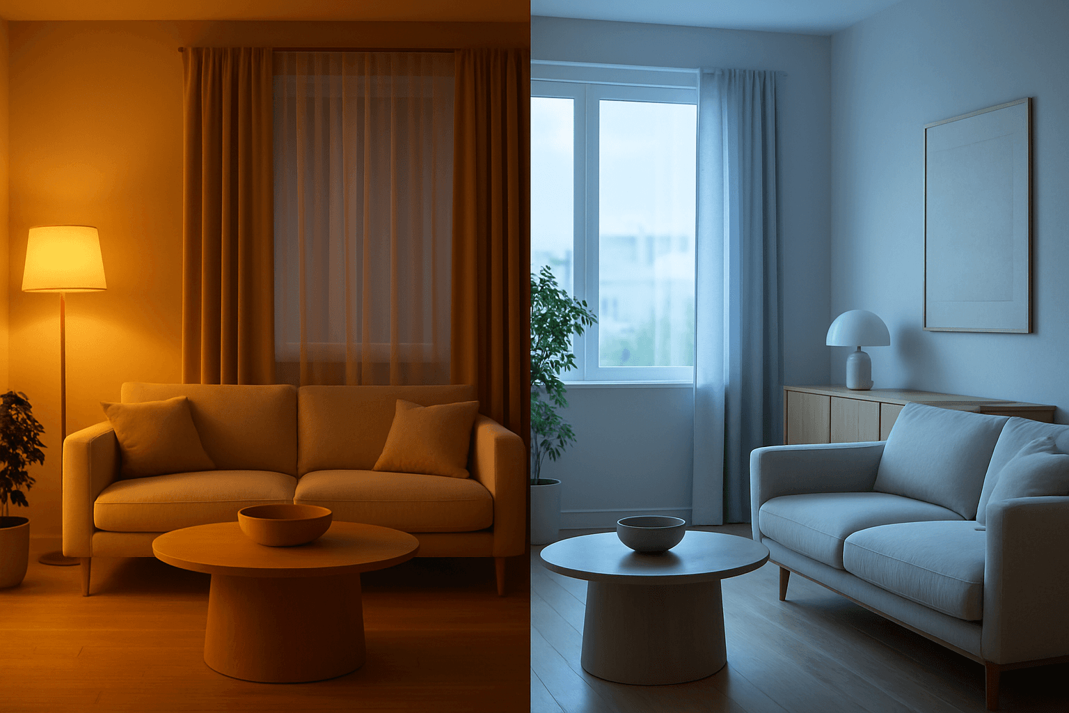
Color Temperature Adjustment is a vital tool in AI image prompt crafting, allowing creators to fine-tune the emotional and visual tone of their images. By manipulating color temperature, users can invite feelings of warmth and comfort or convey crispness and coolness, enhancing the context or story. This adjustment effectively tightens the connection between an image’s lighting environment and its intended impression, such as a warm sunset scene or a cool winter morning. Understanding and applying color temperature improves realism and artistic expression in many visual projects, from photography-style renders to stylized artworks.
Analog Film Color Palette
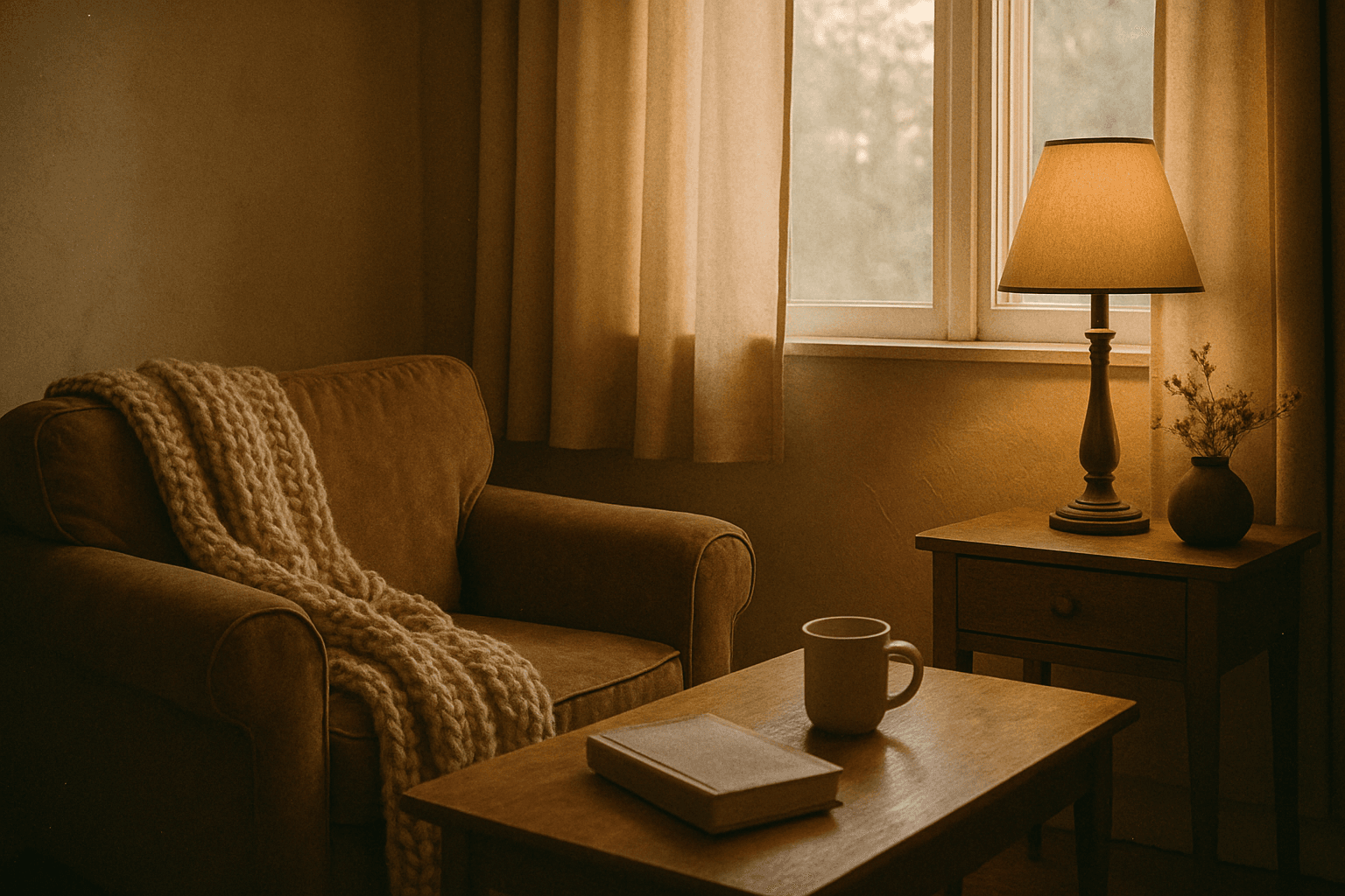
The Analog Film Color Palette is a popular keyword in AI image generation, used to achieve an aesthetic inspired by classic analog photography. It encourages AI models to emulate the color tones of vintage film rolls, incorporating soft reds, dusty blues, faded greens, and warm beige hues. This palette adds emotional depth and a nostalgic atmosphere to images, evoking memories of the past with subtle imperfections like gentle grain and nuanced light scattering. It is highly valued for creating editorial looks, lifestyle imagery, and artistic photographs that stand out for their authenticity and mood. Incorporating this palette can elevate digital images beyond bright, clinical colors toward more tactile, artistic visuals.

Subtle Gradient Color Blends
Subtle Gradient Color Blends are an essential visual technique in AI-generated imagery that enhance the overall composition and mood by incorporating gentle shifts between hues. These blends create a polished, professional look by avoiding abrupt color changes and enabling a seamless flow that can simulate natural lighting, shadows, or material surfaces. Using subtle gradients in prompts encourages AI models to produce images with refined color transitions that elevate the realism and elegance, making them perfect for backgrounds, product visualization, or editorial illustrations. Incorporating subtle color gradients helps establish depth while maintaining a clean and sophisticated style, highly valued in modern design and digital art.
Balanced Color Temperature
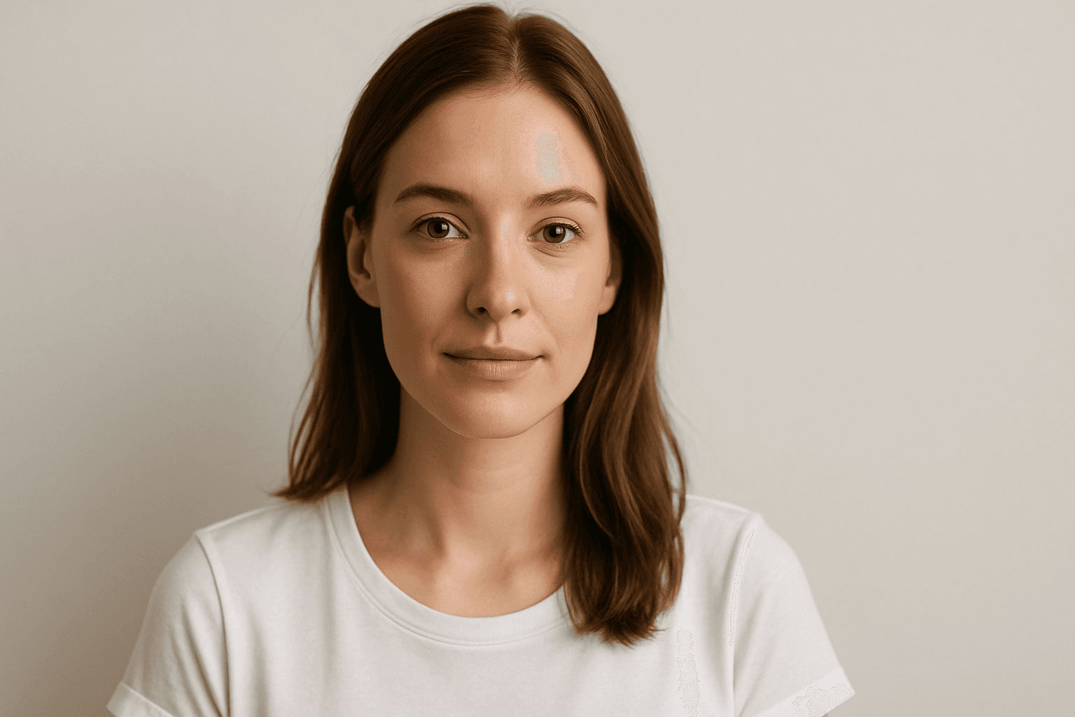
Balanced Color Temperature in AI-generated images ensures that lighting appears natural and true-to-life, avoiding overpowering warm or cool tones. This quality impacts the mood and realism of visuals by maintaining a neutral color balance, making images suitable for professional presentations, product photography, and editorial content. By controlling color temperature, artists and creators can highlight details without unnatural tints, producing polished and visually coherent artworks.
Earthy Warm Color Scheme
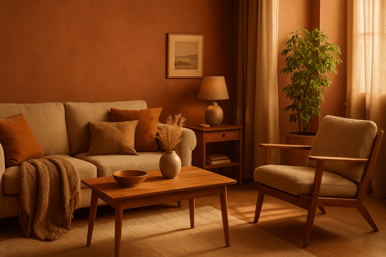
The Earthy Warm Color Scheme is a popular choice for artists and designers aiming to create images that feel natural, comforting, and connected to the environment. By focusing on warm, muted earth tones, this scheme lends a timeless aesthetic suited for a variety of subjects, including landscapes, portraits, interiors, and product shots. Using this palette in AI image prompts can help achieve visuals that emphasize quiet warmth and natural beauty, often evoking rustic charm or bohemian moods. It's well-suited for editorial photography, lifestyle branding, and environmental themes, enhancing images with a sophisticated yet approachable mood.

Soft Muted Color Palette
Using a Soft Muted Color Palette in AI-generated imagery influences the mood and style by incorporating subdued and delicate colors. This approach conveys sophistication, tranquility, and natural beauty, making visuals suitable for subtle branding, lifestyle photography, and editorial contexts. It avoids bright or saturated colors, instead emphasizing nuance and refinement. Artists and designers use it to evoke feelings of warmth, nostalgia, or modern minimalism, enhancing the visual narrative through controlled color harmony and soft contrasts.