Balanced Color Temperature
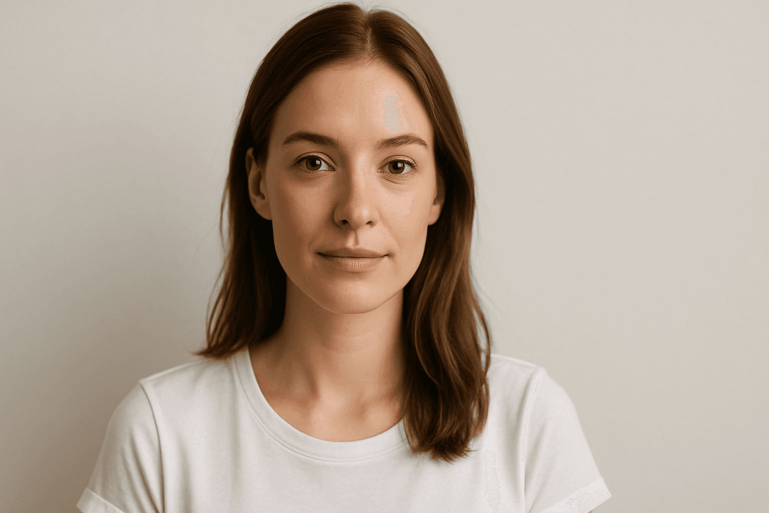
Balanced Color Temperature in AI-generated images ensures that lighting appears natural and true-to-life, avoiding overpowering warm or cool tones. This quality impacts the mood and realism of visuals by maintaining a neutral color balance, making images suitable for professional presentations, product photography, and editorial content. By controlling color temperature, artists and creators can highlight details without unnatural tints, producing polished and visually coherent artworks.
Definition
Balanced Color Temperature means the even blend of warm and cool lighting tones in an image. It enables AI models to create visuals with neutral lighting that avoids overly orange or blue color casts, generating realistic and comfortable color rendering.
Visual Characteristics
- Neutral light without dominant warm or cool hues
- Natural skin tones appearing neither too red/orange nor blue/pale
- Soft and natural transitions between light and shade
Prompt Formula
Use these phrase structures to guide balanced lighting: - "balanced color temperature, neutral light" - "natural lighting with warm and cool tones evenly mixed" - "soft, harmonious light blending warm and cool hues" Combine with subject and environment descriptors for tailored results.
Best Use Cases
- Product photography requiring color accuracy
- Portraits needing realistic skin tones and natural light
- Interior scenes showing authentic ambient lighting
Creative Variations
To add variety while maintaining balance: - Experiment with different times of day to vary natural light warmth (morning to evening) - Incorporate subtle reflections to enhance depth - Combine balanced color temperature with different compositional styles, such as minimalism or cozy interiors - Use complementary colors in the scene to enhance the neutral lighting's effect These tweaks prevent repetitiveness and maintain engaging visuals.
Industry Applications
Balanced color temperature is prized across diverse fields: - In e-commerce, it ensures product colors appear true-to-life boosting buyer confidence - Editorial photography uses it to maintain consistent skin tones and mood - Interior design renders benefit by accurately representing materials under neutral lighting Its versatility makes it integral to professional visual content creation.
- E-commerce product imagery
- Editorial photography and magazines
- Interior design visualization
Model-Specific Tips
When working with modern AI image generators: - Use simple descriptive phrases like “balanced color temperature” rather than complex technical terms - Combine with related lighting descriptors for nuanced control (e.g., “soft natural light”) - Avoid contradictory terms like “warm” or “cool” alone to maintain neutrality - Testing slight variations helps find the best prompt balance for a given model.
FAQ
How do I describe balanced color temperature in AI prompts?
Use straightforward phrases such as "balanced color temperature," "neutral lighting," or "even warm and cool light mix" to convey balanced lighting conditions.
Why is balanced color temperature important for AI images?
It ensures natural and accurate color representation, avoiding unrealistic warm or cool color casts that can detract from image quality and realism.
Continue Exploring
Related Prompts
Color Temperature Adjustment
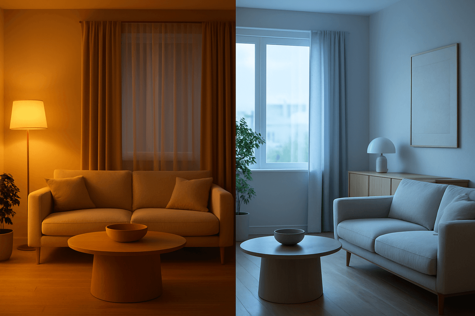
Color Temperature Adjustment is a vital tool in AI image prompt crafting, allowing creators to fine-tune the emotional and visual tone of their images. By manipulating color temperature, users can invite feelings of warmth and comfort or convey crispness and coolness, enhancing the context or story. This adjustment effectively tightens the connection between an image’s lighting environment and its intended impression, such as a warm sunset scene or a cool winter morning. Understanding and applying color temperature improves realism and artistic expression in many visual projects, from photography-style renders to stylized artworks.

Golden Hour Color Grading
Golden Hour Color Grading is a popular technique used in AI-generated imagery to evoke the warmth and nuanced lighting of early morning or late afternoon sun. By incorporating this keyword, artists and designers can infuse a sense of natural beauty, highlight textures subtly, and create emotionally engaging visuals. This color grading enriches photographic or pictorial prompts by adding depth through soft shadows and warm highlights, transforming otherwise flat images into luminous and aesthetically pleasing works that capture a fleeting moment of natural light and atmosphere.
Earthy Warm Color Scheme
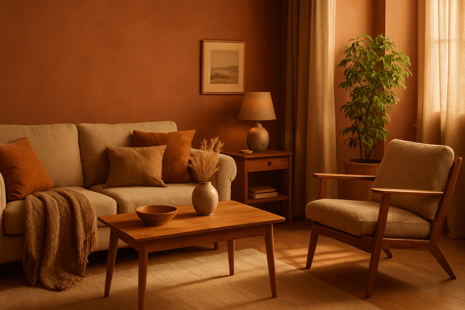
The Earthy Warm Color Scheme is a popular choice for artists and designers aiming to create images that feel natural, comforting, and connected to the environment. By focusing on warm, muted earth tones, this scheme lends a timeless aesthetic suited for a variety of subjects, including landscapes, portraits, interiors, and product shots. Using this palette in AI image prompts can help achieve visuals that emphasize quiet warmth and natural beauty, often evoking rustic charm or bohemian moods. It's well-suited for editorial photography, lifestyle branding, and environmental themes, enhancing images with a sophisticated yet approachable mood.

Pastel Color Harmonies
Pastel Color Harmonies are essential for creating gentle and visually pleasing images that emphasize softness and subtlety in color. Using pastel palettes, AI-generated images gain a delicate aesthetic often associated with calm, elegance, and modern minimalism. This approach mitigates harsh contrasts and intense hues, producing visuals ideal for editorial content, branding, and art that need a serene or sophisticated vibe. Incorporating pastel harmonies into AI prompts modifies the image’s overall mood, making scenes feel airy and inviting while maintaining a coherent and balanced color distribution.

Analogous Warm Color Scheme
Analogous Warm Color Schemes employ colors adjacent on the color wheel within warm tones—reds, oranges, and yellows—to produce harmonious, vibrant images. In AI-generated art, specifying this scheme guides the model to focus on these related colors, resulting in visuals that feel unified and energetic. This scheme evokes warmth, comfort, and optimism, excellent for compositions needing a welcoming or lively mood. Using it strategically in prompts helps artists and designers achieve balanced, naturally blended color palettes that enhance emotional impact without overwhelming the viewer.

Monochrome Color Palette
Employing a monochrome color palette in AI-generated images allows for creating minimalistic yet striking visuals. By constraining colors to one hue family, creators can convey mood and style consistently while focusing on composition and detail. This technique excels in editorial photography, product presentations, and artistic portraits, where color distraction is minimized and storytelling through form and light is enhanced. Using monochrome prompts guides the AI to simulate realistic materials and subtle depth through nuanced shading, resulting in premium, polished images suitable for professional use.