Matte Surface Texture
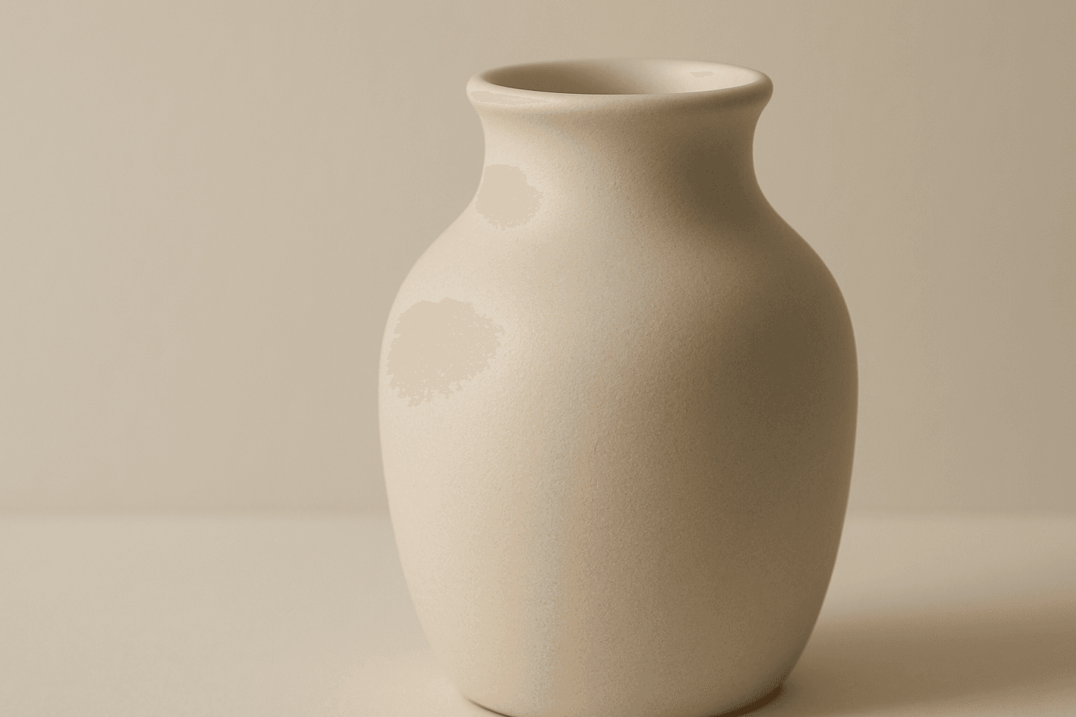
The 'Matte Surface Texture' keyword in AI image generation is fundamental when aiming for realism and subtlety in material appearance. Unlike glossy or reflective surfaces, matte textures offer a restrained light interaction, producing soft shadows and even visual tones. This texture is valued for its fine grain, softness, and understated elegance, making images appear modern and refined. Including this keyword enhances the material rendition of subjects like ceramics, paper, cloth, or painted surfaces, enabling photorealistic or stylized outputs that emphasize tactile qualities without distracting reflections. It's especially effective for editorial visuals, product mockups, and interior materials where controlling reflection is crucial.
Definition
Matte Surface Texture represents a finish with low reflectivity that scatters light uniformly, creating a soft appearance with no shine or specular highlights. In AI image prompts, it instructs the model to render surfaces that lack glossiness, emphasizing natural and subdued light reflection. This keyword is key when aiming for realistic or artistic images that showcase smooth or gently rough textures without distracting glare.
Prompt Formula
Use these formula patterns to incorporate matte surface texture effectively: - "[subject] with matte surface texture, soft diffused lighting" - "close-up on [material/object] featuring matte finish, minimal reflections" - "[scene] showcasing matte textures, natural light, subtle shadows" Combining terms like 'matte finish', 'soft lighting', 'textured surface', and 'no shine' guides AI to prioritize diffuse reflection and detail over glossiness.
- [subject] with matte surface texture, soft diffused lighting
- close-up on [material/object] featuring matte finish, minimal reflections
- [scene] showcasing matte textures, natural light, subtle shadows
Best Use Cases
- Product visualization for cosmetics and packaging with understated finishes
- Editorial photography mocks emphasizing skin tones and fabric textures
- Interior design renders showcasing matte wall paints and furniture finishes
Creative Variations
To avoid repetitive visuals, try these variations when prompting matte surface texture: - Alter lighting from natural daylight to warm artificial or moody studio setups - Use different color palettes and saturation levels to shift mood - Combine matte textures with contrasting materials like soft fabrics or rough stone - Experiment with macro, mid-range, or wide-angle compositions - Introduce subtle environmental elements that interact with matte surfaces such as soft shadows or haze
- Change lighting style: daylight, warm interior, studio light
- Vary color saturation: pastel tones, deep muted colors, monochrome
- Mix matte with other textures: soft fabric, rough stone
- Shift composition scale: macro close-ups, medium shots, wide interiors
- Add environmental effects: soft shadows, light haze
Industry Applications
- Advertising product shots requiring realistic, non-reflective finishes
- Ecommerce images presenting fashion items with matte fabric detail
- Interior design presentations highlighting matte paint and materials
Common Mistakes
Common errors when prompting for matte surface texture include requesting conflicting qualities like gloss or specular shine alongside matte, which confuses the AI and results in unrealistic blends. Overusing the keyword without specifying lighting or material type may produce flat or dull images lacking depth. Additionally, neglecting to balance texture with appropriate color and shadow detail can yield muddy or overly uniform surfaces. To avoid these pitfalls, clearly define the subject, lighting conditions, and complementary texture attributes to ensure the matte finish enriches the visual realism and appeal.
- Do not combine 'matte' with 'glossy' or 'shiny' in the same prompt
- Specify lighting conditions to support the matte effect
- Balance surface texture with color and shadow to avoid flatness
- Avoid generic phrasing; define material type for better accuracy
FAQ
How does adding 'matte surface texture' affect the lighting in AI images?
Adding 'matte surface texture' directs the AI to reduce specular highlights and glossy reflections, resulting in softer, more evenly diffused lighting across surfaces, which emphasizes natural, non-reflective material qualities.
Can 'matte surface texture' be combined with other texture keywords?
Yes, combining 'matte surface texture' with related keywords like 'rough' or 'soft fabric' can create nuanced surfaces, but avoid pairing it with contradictory terms like 'glossy' to maintain clear material properties in the image.
Continue Exploring
Related Prompts
Chalkboard Surface Texture
Chalkboard Surface Texture captures the unique look and feel of traditional blackboards commonly used in classrooms. It combines dark, matte backgrounds with subtle surface grains and visible chalk-related markings like smudges and partial rubbings. This texture adds tactility and context to illustrations, educational materials, design projects, or product simulations involving chalkboards. When integrated into AI image prompts, it guides the AI to emphasize realistic surface details and material qualities, avoiding overly smooth or flat rendering. This results in images that evoke familiarity and authenticity, making them ideal for conveying variety in textural compositions or thematic classroom scenarios.
Soft Matte Paper Texture
Soft Matte Paper Texture is a specialized prompt keyword that helps artists and designers generate images featuring realistic, tactile paper surfaces with a matte finish. This texture is characterized by subdued reflections and a soft, natural look that avoids glare or shine. Using this keyword in AI prompts supports creations such as book covers, packaging mockups, stationery backgrounds, and fine art prints where the paper quality matters. The resulting images carry a premium aesthetic, imitating high-quality paper stock that is often sought after in print-design visualizations and marketing materials. Overall, employing Soft Matte Paper Texture enriches an AI image with subtle tactile cues contributing to a refined, understated finish.

Plasticized Surface Texture
Plasticized Surface Texture emphasizes a sleek, shiny appearance with a polished, flexible quality resembling plastic materials. When used in AI image generation, it transforms surfaces into smooth, glossy finishes characterized by bright highlights and subtle reflections. This texture does not show roughness or matte properties but instead creates a distinctive synthetic look often associated with consumer products, packaging, or modern design elements. It helps convey contemporary, clean aesthetics and can enhance visual emphasis on material quality in digital rendering or conceptual imagery.

Wood Grain Surface Texture
Wood grain surface texture captures the intricate patterns and natural beauty found in wooden materials. This texture is characterized by flowing lines, knots, and a warm color palette that conjures the organic essence of wood. When incorporated in AI image generation prompts, it helps models produce authentic wooden surfaces, from smooth polished floors to rustic furniture with visible fibers. Wood grain lends tactile depth and aesthetic appeal, making images more immersive and rich in detail. Its versatility allows for use across design, interior visualization, product mockups, and artistic compositions, enhancing the material realism dramatically.
Granular Surface Texture
Granular Surface Texture is a key descriptive keyword used in AI image prompting to achieve photorealistic and tactile surfaces characterized by finely distributed grains or tiny particles. This texture offers an intricate level of detail that enriches the material quality of objects, making them appear more natural and tangible. When included in prompts, it encourages the generation of surfaces akin to sandpaper, concrete, rough fabric, or unpolished stone, providing visual complexity that appeals to designers and artists alike. Its use can transform otherwise flat or generic surfaces into engaging, dynamic visuals with depth and interest. This makes it valuable across many creative projects, from product visualization to environmental design.
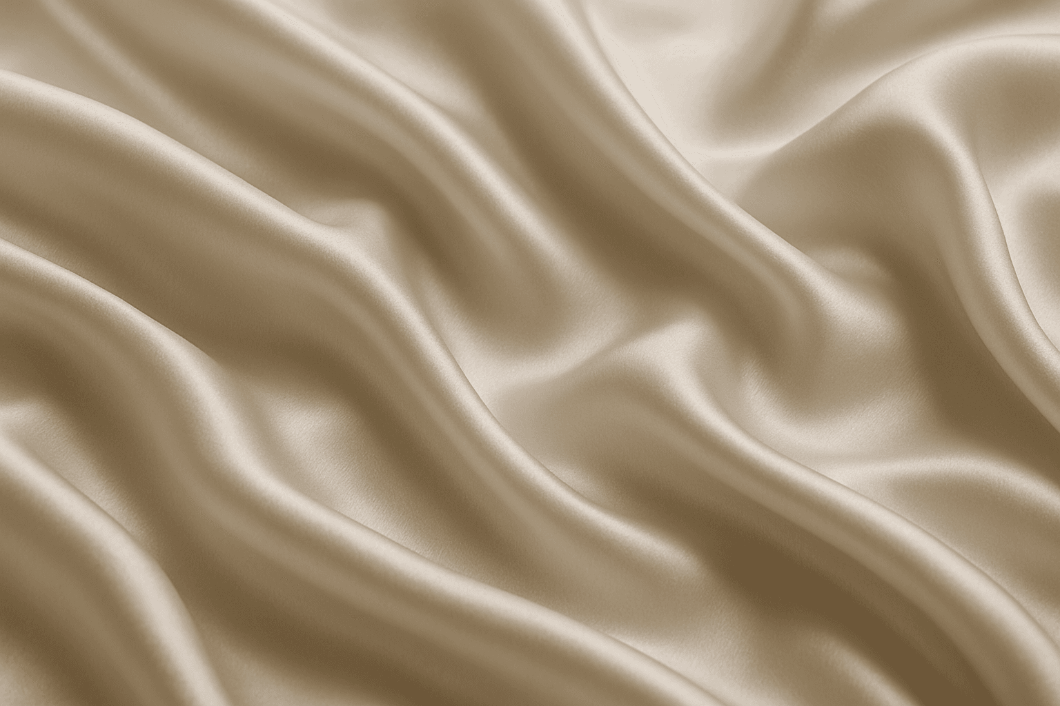
Smooth Silk Fabric Texture
Smooth silk fabric texture is prized for its elegant appearance and soft touch, making it a favored material in fashion, interiors, and luxury goods. In AI image generation, this keyword triggers the creation of images showcasing silk's signature sheen, fluid motion, and delicate surface details. When used in prompts, it helps produce visuals with refined lighting that emphasize silk’s smoothness and reflective quality. This texture enhances images requiring a premium, sophisticated look by mimicking silk’s characteristic glow and tactile softness, suitable for editorial hero shots, product photography simulations, and stylized compositions.